Kate Farms— Putting Consumers at the Heart of Medical Nutrition
Kate Farms is the #1 plant-based nutritional formula on the market, serving thousands of patients suffering from severe, chronic diseases to less serious medical issues.
With a refreshed positioning and newly identified target audience in hand, they partnered with Aruliden to create a new brand voice, creative strategy, portfolio architecture and packaging system to clarify and express how they show up across products and communications.
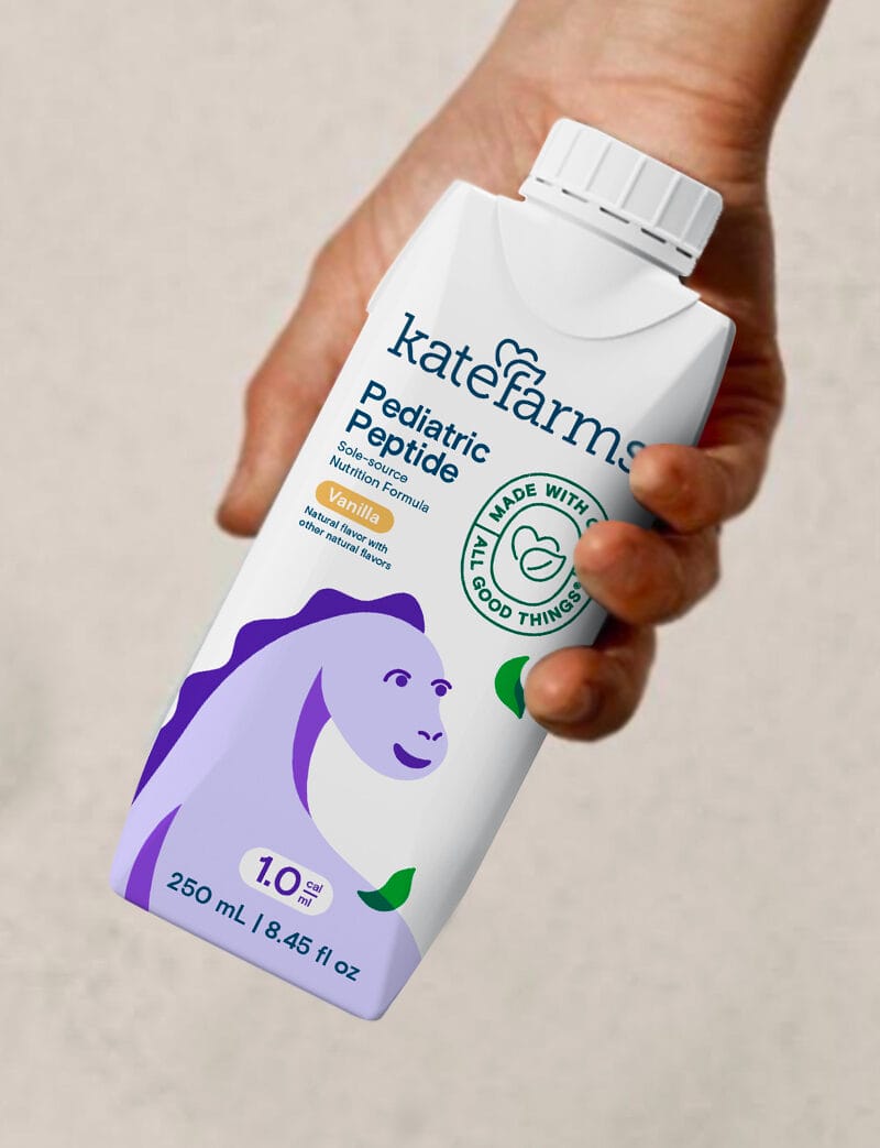
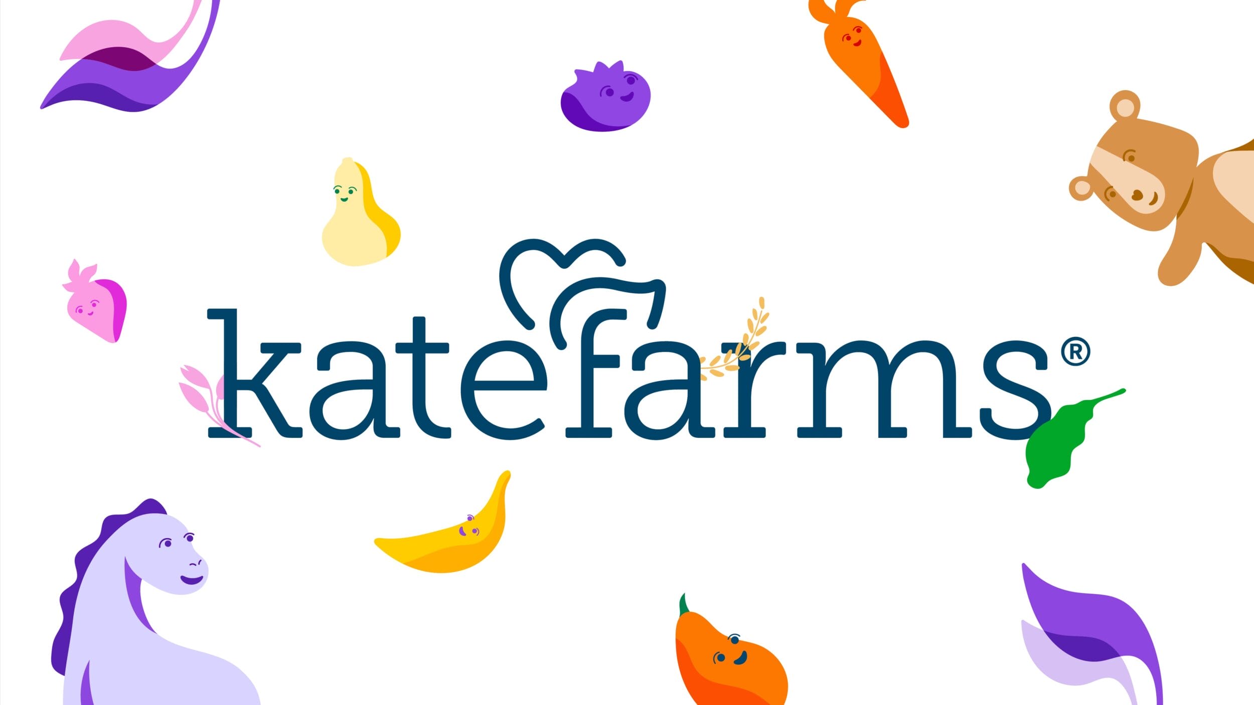
We simplified the Kate Farms logo, evolving the tree for clearer messaging, while maintaining familiarity. The new wordmark highlights both the human-centered care and natural goodness at the brand’s core.
Kate Farms shakes and formulas are Certified USDA Organic, Non-GMO Project Verified, and free from common allergens. Inspired by the seals associated with these claims, we designed a Kate Farms seal of approval to highlight the brand’s goodness in line with its personality.
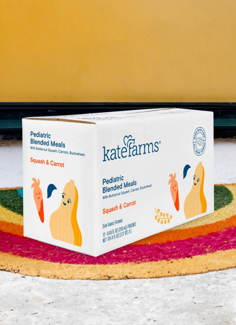
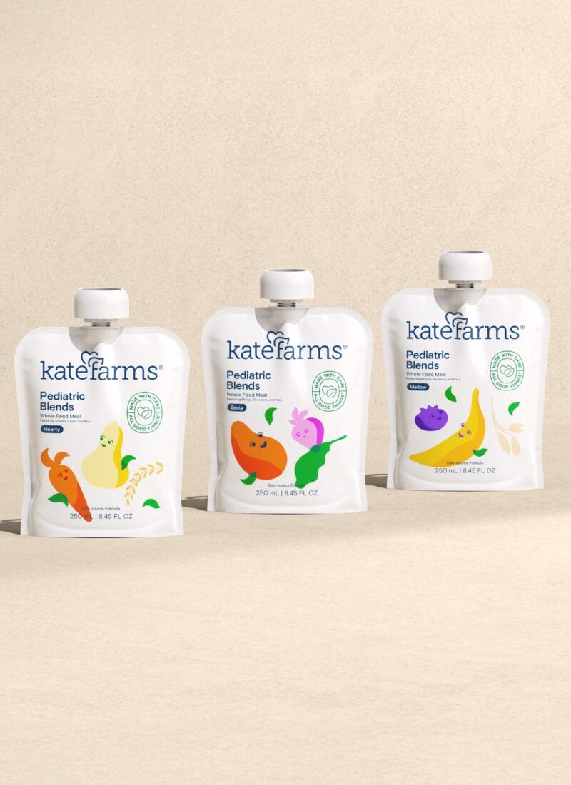
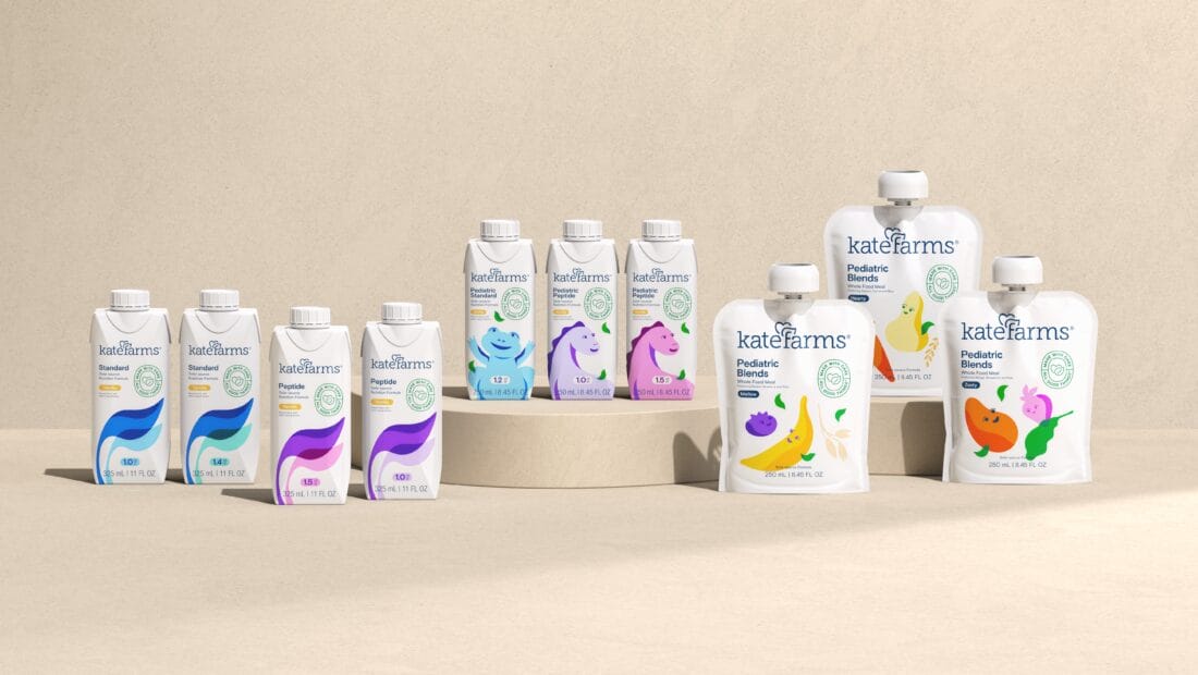
Packaging and Illustration
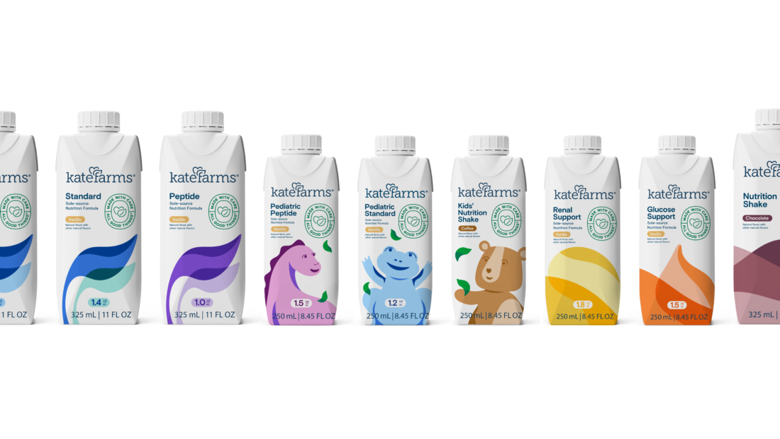
We conducted in-depth customer research to illuminate key personas, uncovering needs, pain points, and motivations within the nutrition category. These insights guided a more consumer-centric, needs-driven messaging strategy and product architecture.
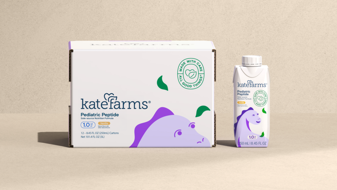
The new system brings clarity and consistency across the portfolio, making key details—product type, caloric density, and flavor—easy to find for all consumers.
Each product showcases illustrations tailored to its purpose—from friendly, huggable characters to strong, plant-inspired forms and vibrant whole food ingredients.