Ledn— Where digital assets come to life
Ledn is a digital asset lender, providing financial products and services to crypto holders that let them leverage their digital holdings like cash. By 2022, the business had secured its position as a trustworthy crypto custodian. They turned to Aruliden to create an identity and narrative to reinforce this role and establish the brand as a true financial services company.


Ledn sits at the unique intersection between traditional and nontraditional (Crypto) finance. Our challenge was to retain elements of legacy finance while leveraging the future-forward ethos of new finance.
As a digital first brand, web and accessibility requirements positively influenced the identity system from the beginning. Considerations such as UI design were crucial to brand development, as typographic hierarchy, color combinations and visual languages had to achieve ADA/AA compliance.
Brand Foundation
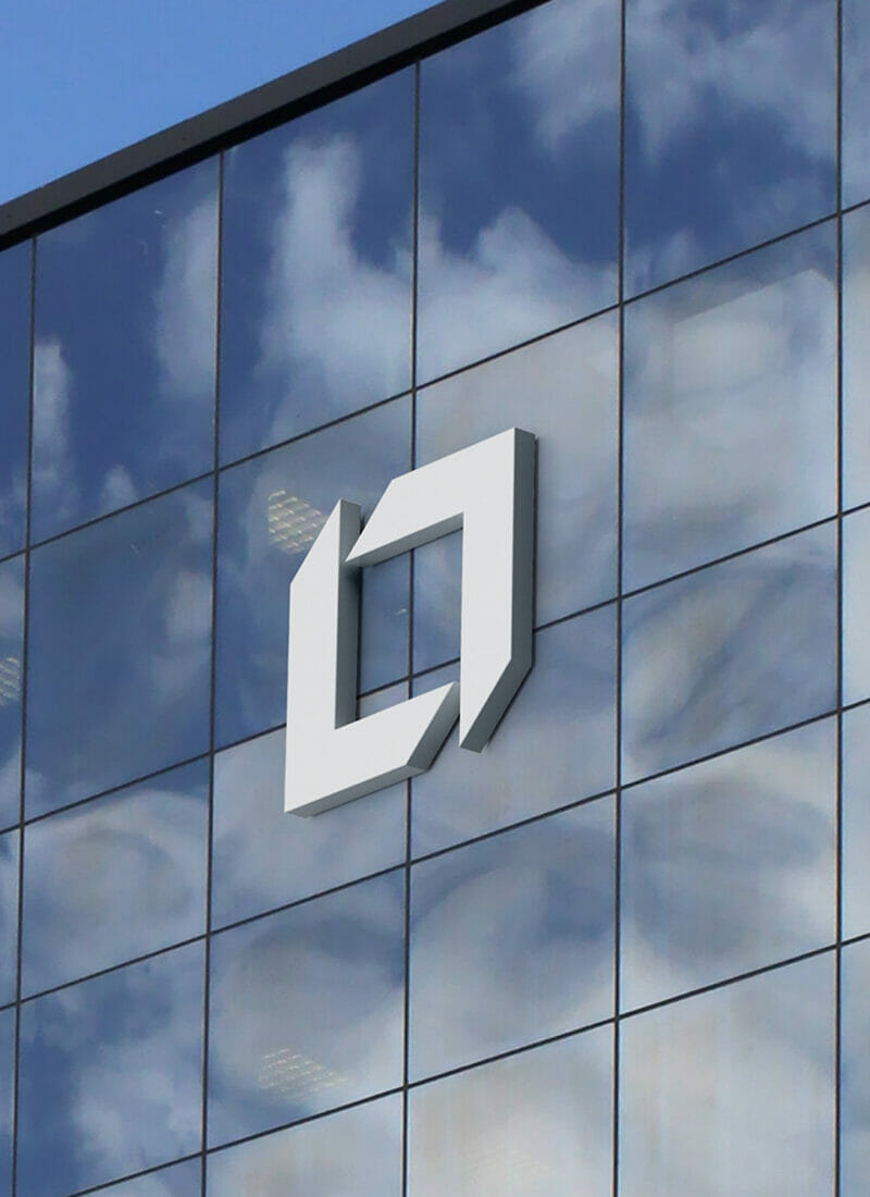
The Ledn logo delivers tangibility through dimensionality, revealing a solid sculptural marque that changes depending on context.
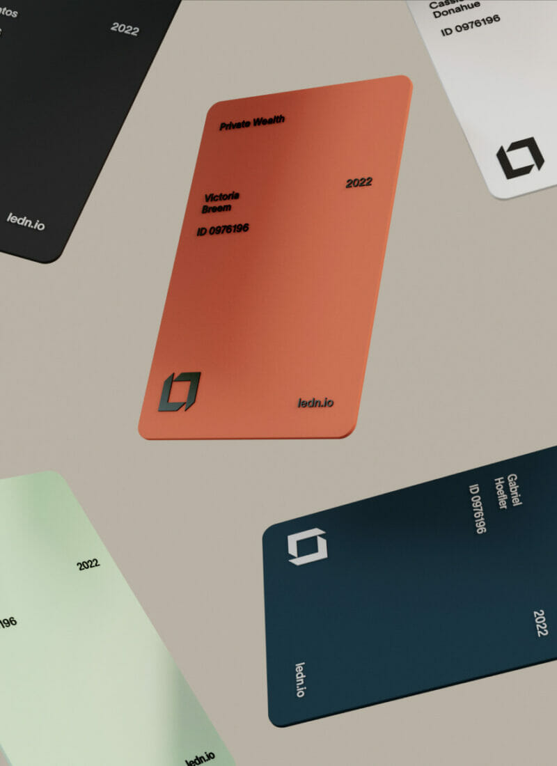
The core color, grounded in Canadian nature, represents trust, privacy and security, while the optimistic secondary palette brings to life deep human and spirited brand values.
A single weight iconography suite was developed to help visualize a range of products, offerings, and benefits that currently feature 55+ icons.
Brand Extension


Secondary graphic patterns utilize abstract forms of the logo to create an ownable visual language that convey messages of growth, simplicity and complexity. These are used in a variety of ways with typographic expression to add legibility, context and emphasis the content.


