Zero— Where metabolic wellness begins
Zero is one of the top intermittent fasting apps on the market guiding the journey that improves relationship to food through personalized fasting plans and advanced tracking. Zero came to us to reposition the brand from fasting to one with a holistic approach to metabolic health.
The challenge was to expand on the brand’s success with fasting and understand the complexity in moving to metabolic health. The goals are neither singular nor perfect, and Zero takes a day by day approach to create positive habits for continued results.
Brand Foundation

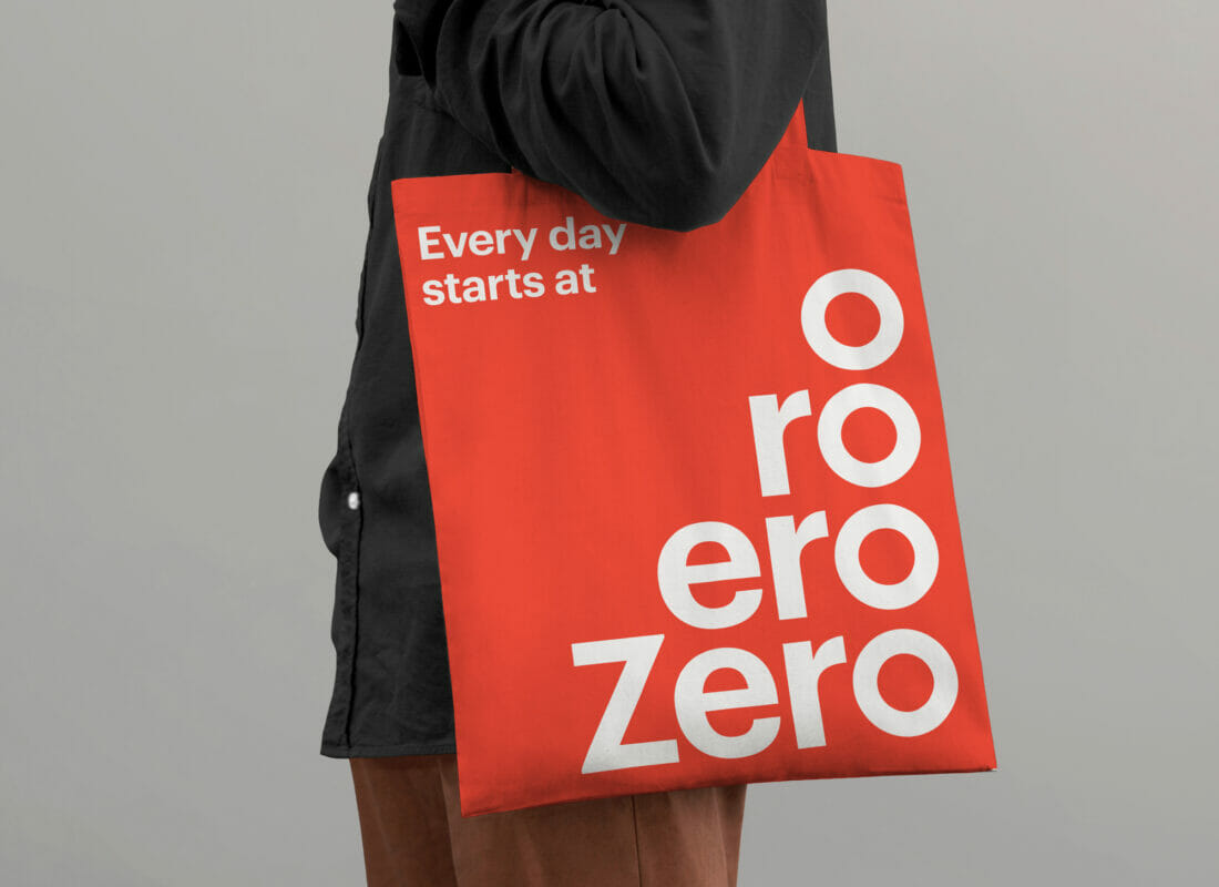
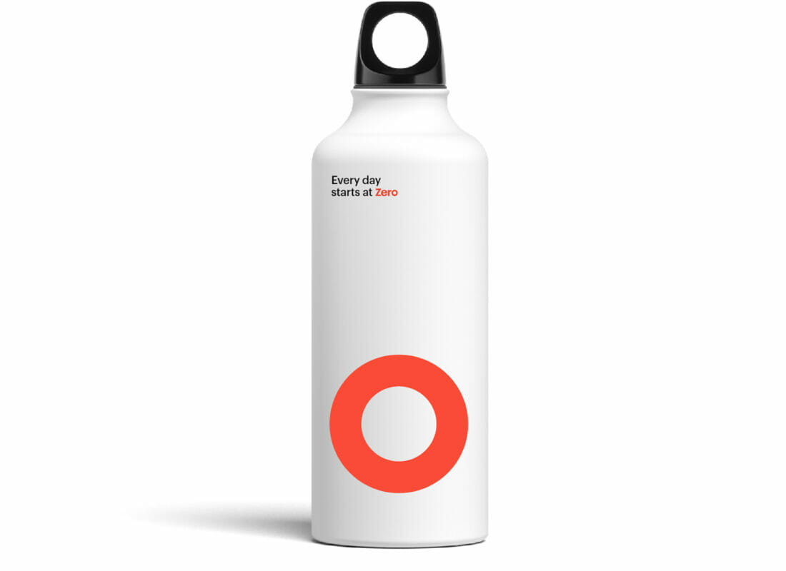
Our approach to the brand was to establish simplicity at the foundation level while adding vibrancy through a diverse color palette. The wordmark integrates a perfect zero as the “o” – a nod to the core timer feature on the app.


Brand Photography
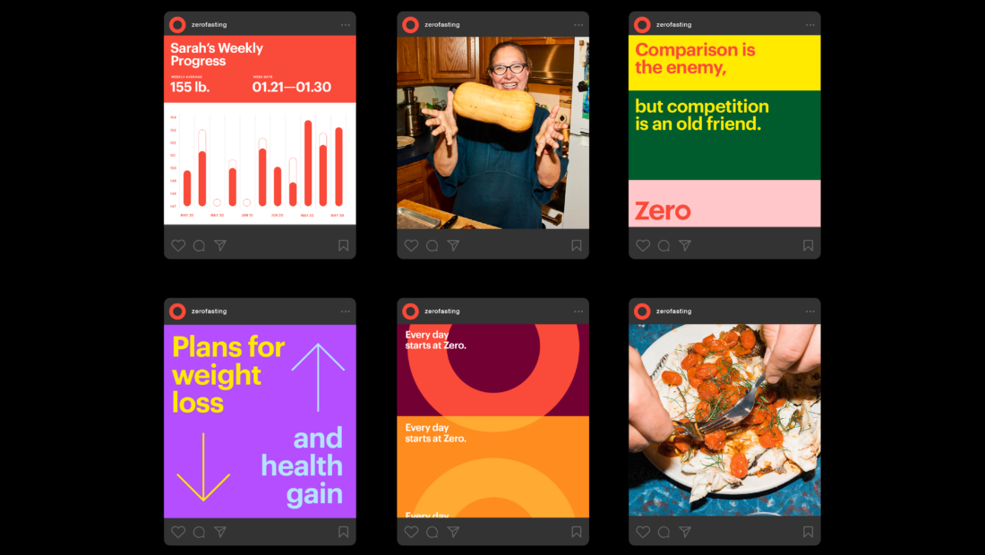
The photographic style is candid and authentic, capturing real people in real moments while emphasizing feelings of honest well being.

Typographic Mantras
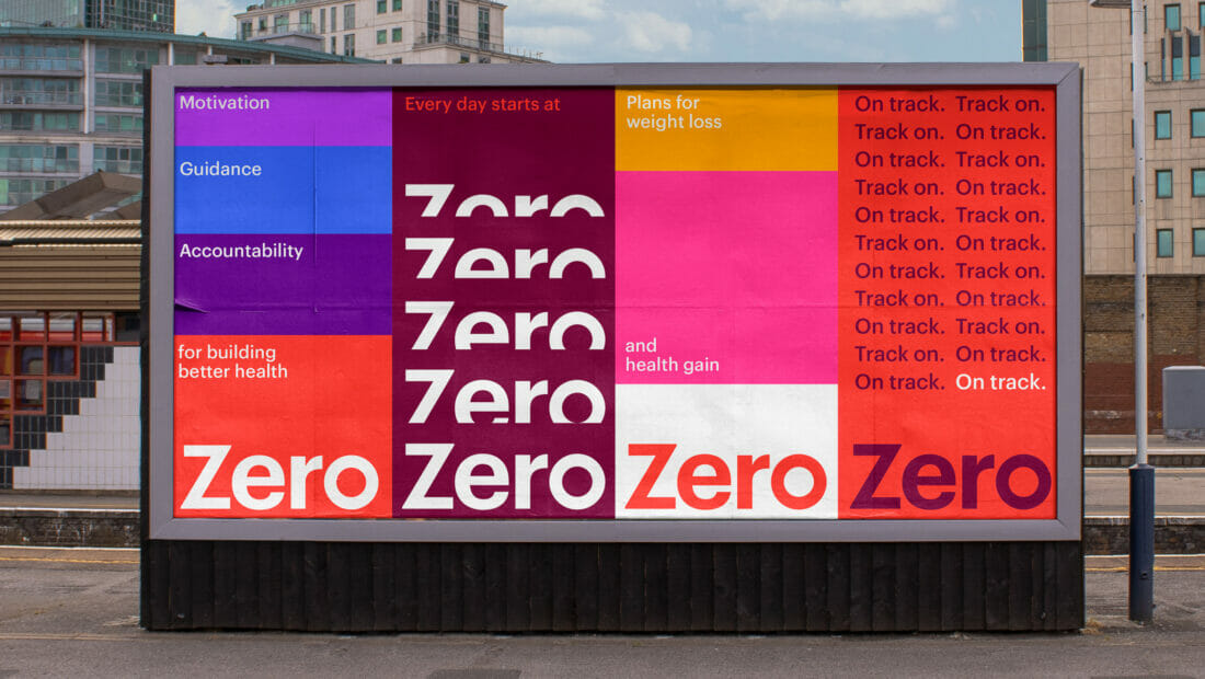
- One of the core brand expressions is the use of typographic mantras, which are repeating affirmation statements that visually represent progress, habit forming, and dedication.
Brand Experience
The digital brand experience ties back to the simplistic brand foundation while its color palette infuses warmth to the minimal and easy-to-use UI system.
The brand’s illustration style celebrates the individual health journey and helps explain complex fasting concepts, in a witty and minimalistic style.
