Merit— Clean beauty that's earned a place on your vanity

Powerhouse Katherine Power approached Aruliden with a vision to create a clean, edited minimalist beauty brand that was considered without sacrificing personality and emotion.
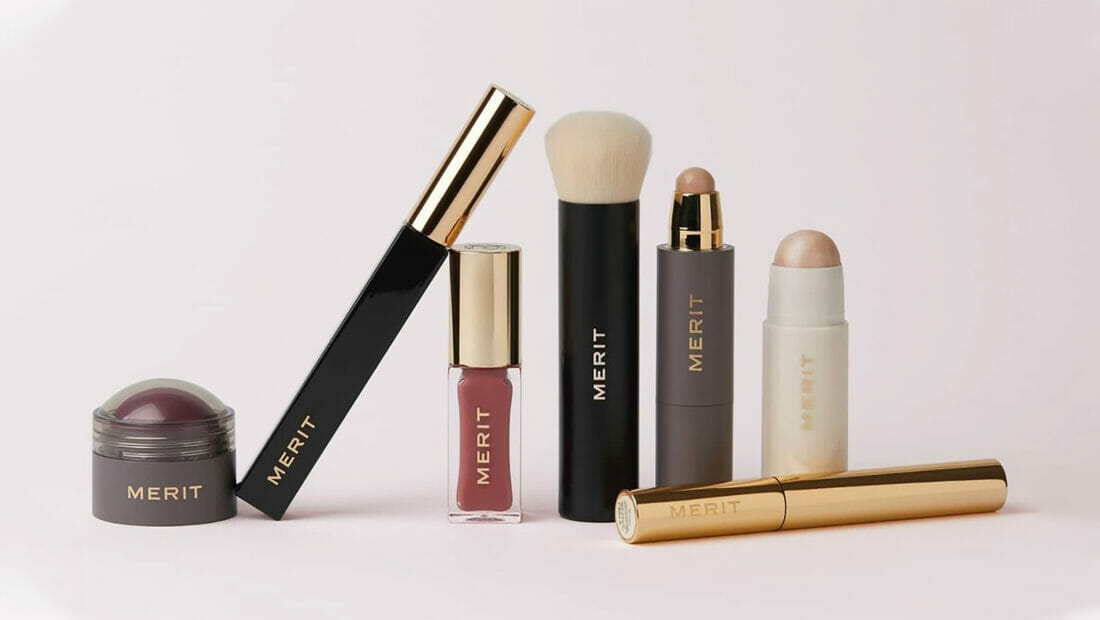
Approach Overview
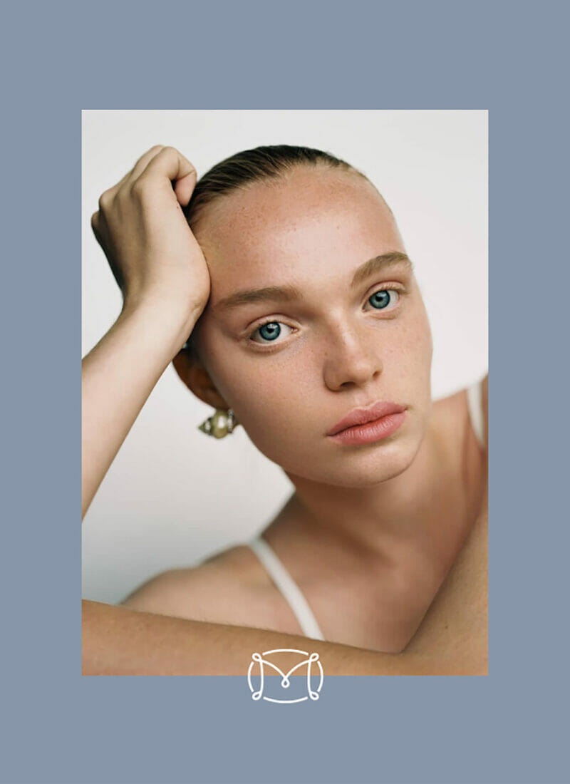
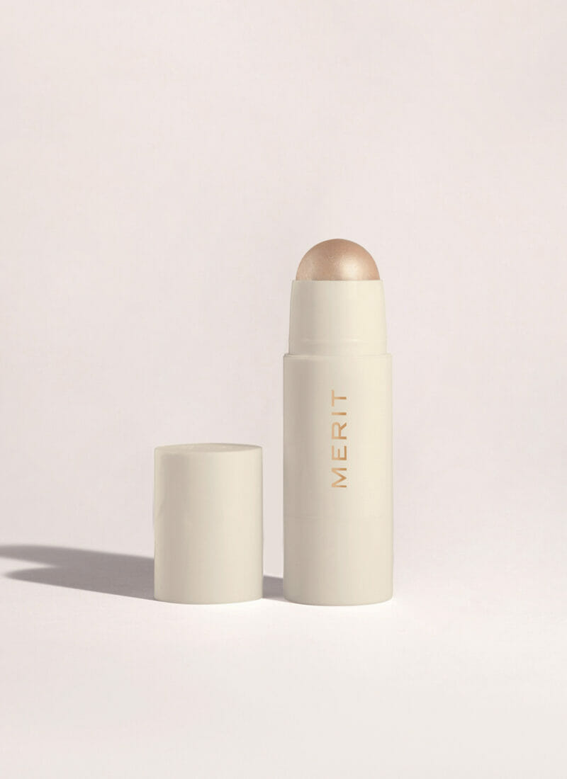
At every step, our process was focused on developing a brand and product line that could meet the standards of even the most discerning customer. With this in mind, we meticulously crafted a strategy, graphic system, and packaging that addressed the Merit woman’s elevated taste, concern for the environment, and need for products that could be used on-the-go.

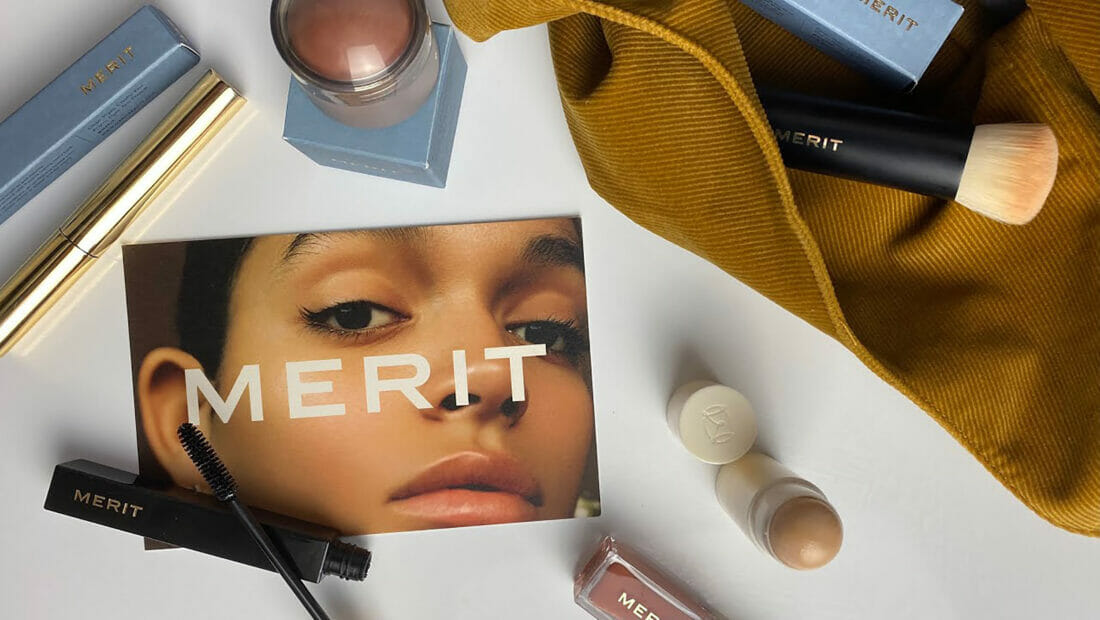
The identity’s bold yet elegant sans serif logotype is paired with a muted color palette to balance simplicity and sophistication while maintaining a strong, straightforward personality.

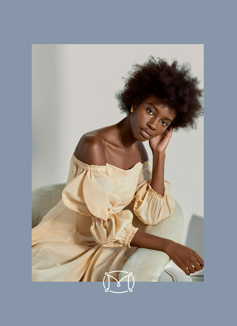
Packaging

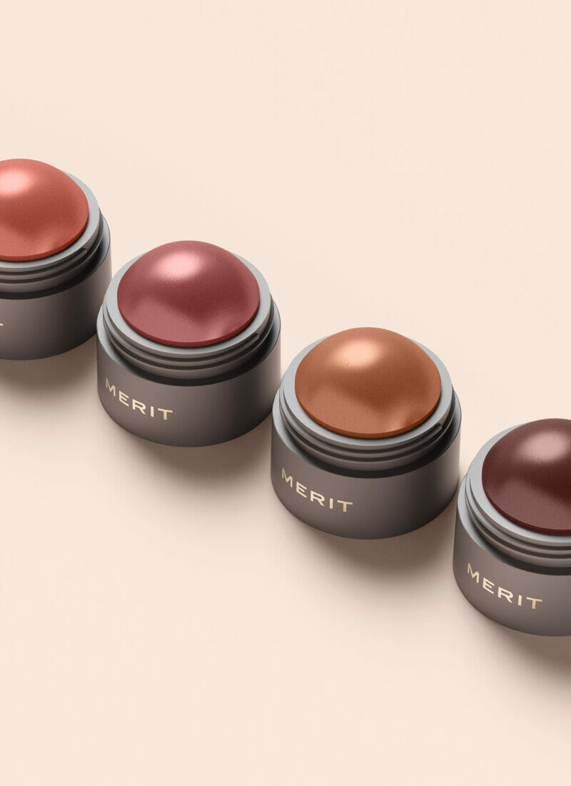
The packaging forms express the brand’s essentialist philosophy through simple, geometric shapes that convey maturity and restraint, while allowing for refillable componentry. PIeces of the collection look to reduction in material to deliver on only what is essential for the most optimal experience. The result combines a minimalist aesthetic with the sustainability demands that merits a spot on your top shelf.

Jasmine Elyssa @jasmineabergil
