Ledn
- Brand Strategy
- Visual Identity
- Art Direction

Ledn
- Art Direction
- Visual Identity
- Brand Strategy
- Website
Ledn sits at the intersection of traditional and nontraditional finance, balancing the familiarity of legacy financial systems with the future-forward ethos of crypto. Aruliden partnered with the company to create an identity and narrative that reinforced its position as a trustworthy digital asset lender while establishing it as a true financial services brand.
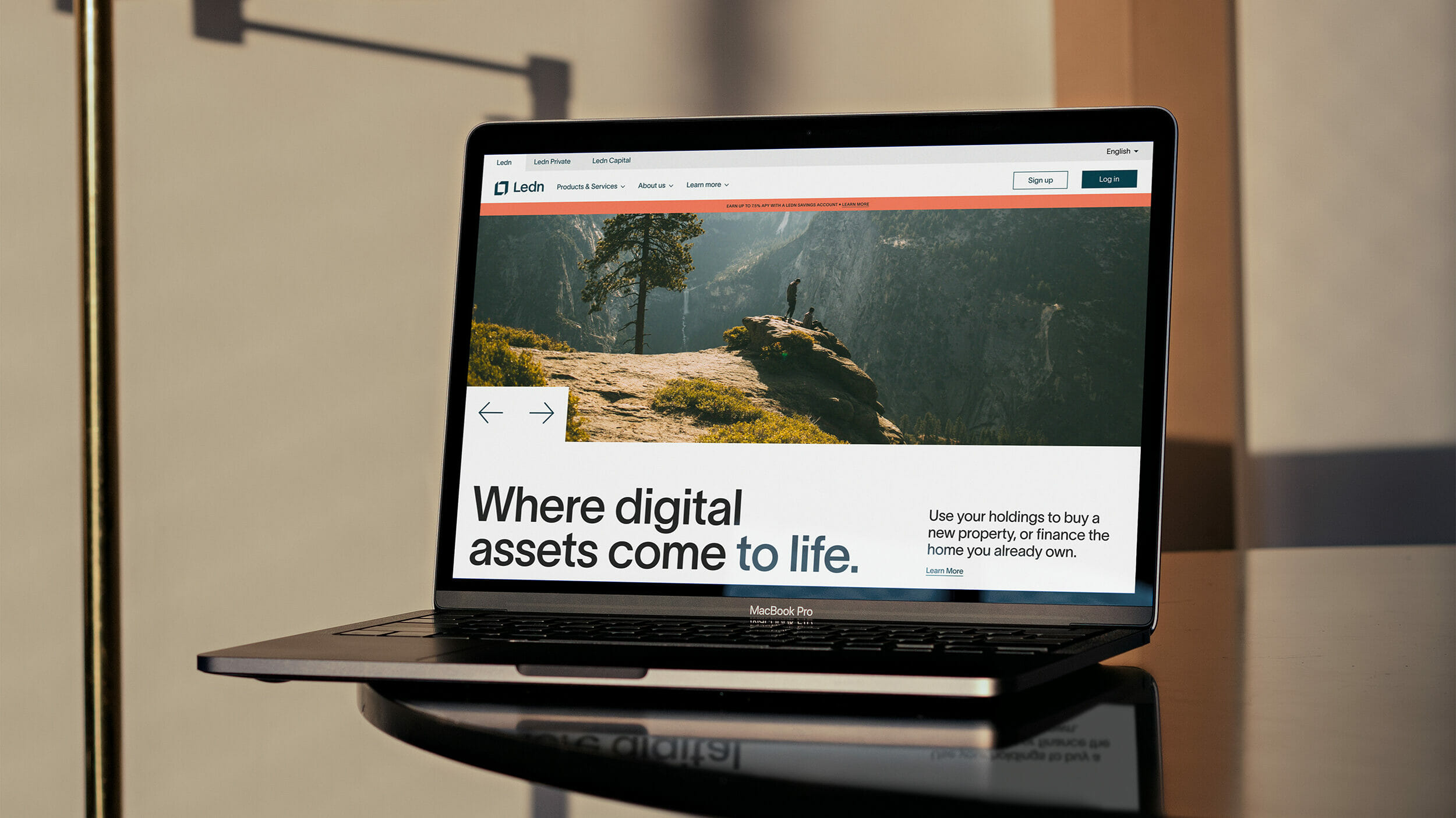
As a digital-first company, accessibility and web functionality informed the identity system from the outset. Considerations such as UI design, typographic hierarchy, color combinations, and visual language were all developed to achieve ADA/AA compliance.
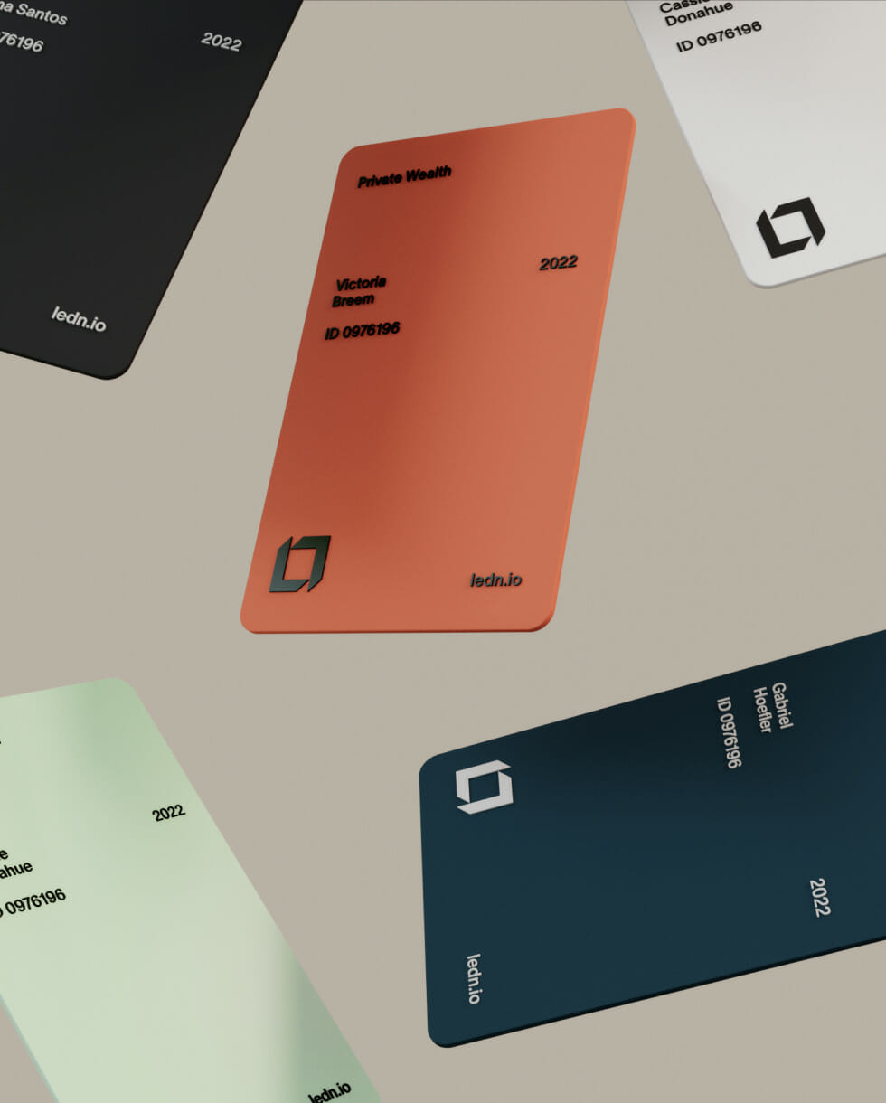
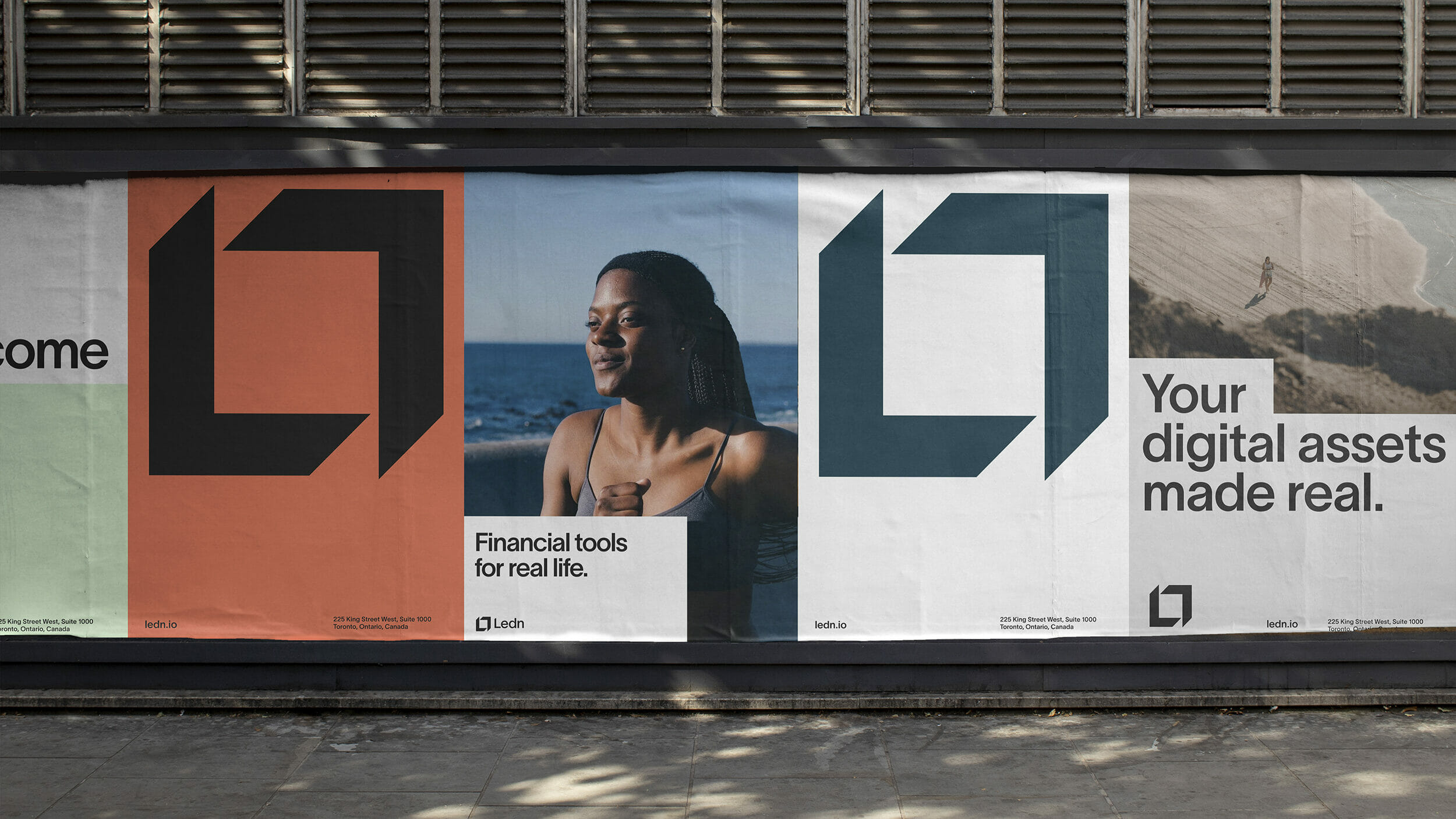
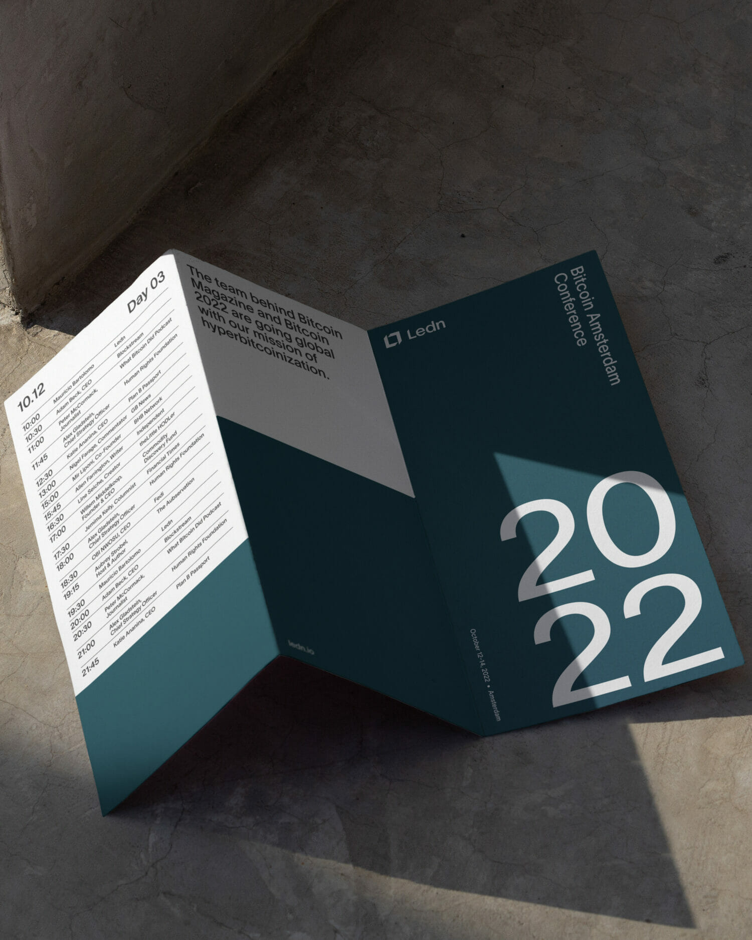
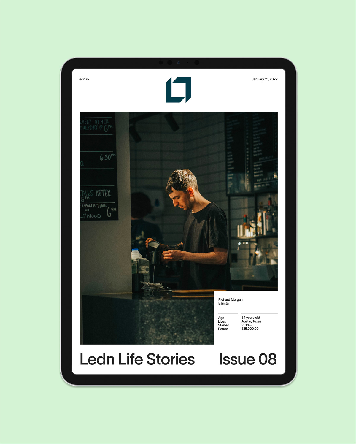
The Ledn logo introduces dimensionality and tangibility through a sculptural marque that shifts depending on context. Grounded in Canadian nature, the core palette communicates trust, privacy, and security, while brighter secondary colors express the brand’s more human and optimistic values.
This system extends into a suite of over 55 single-weight icons designed to visualize products, offerings, and benefits. Secondary graphic patterns abstract the logo into an ownable visual language that conveys growth, simplicity, and complexity, working alongside typography to add clarity, emphasis, and legibility throughout the brand experience.
At its core, Ledn reflects the idea that wealth’s true value lies not in abstraction, but in improving everyday life and the way we move through the world.