Simon Pearce
- Brand Strategy
- Visual Identity
- Art Direction




Simon Pearce
- Brand Strategy
- Visual Identity
- Art Direction
Makers of handblown glassware, Simon Pearce, partnered with Aruliden to redefine their strategic positioning and visual identity. Honoring the Irish history that made them, and the Vermont roots that shaped them, we crafted a strategy and visual identity that celebrates one-of-a-kind hand-made objects, creating with the land, and leaving an impression on every moment.
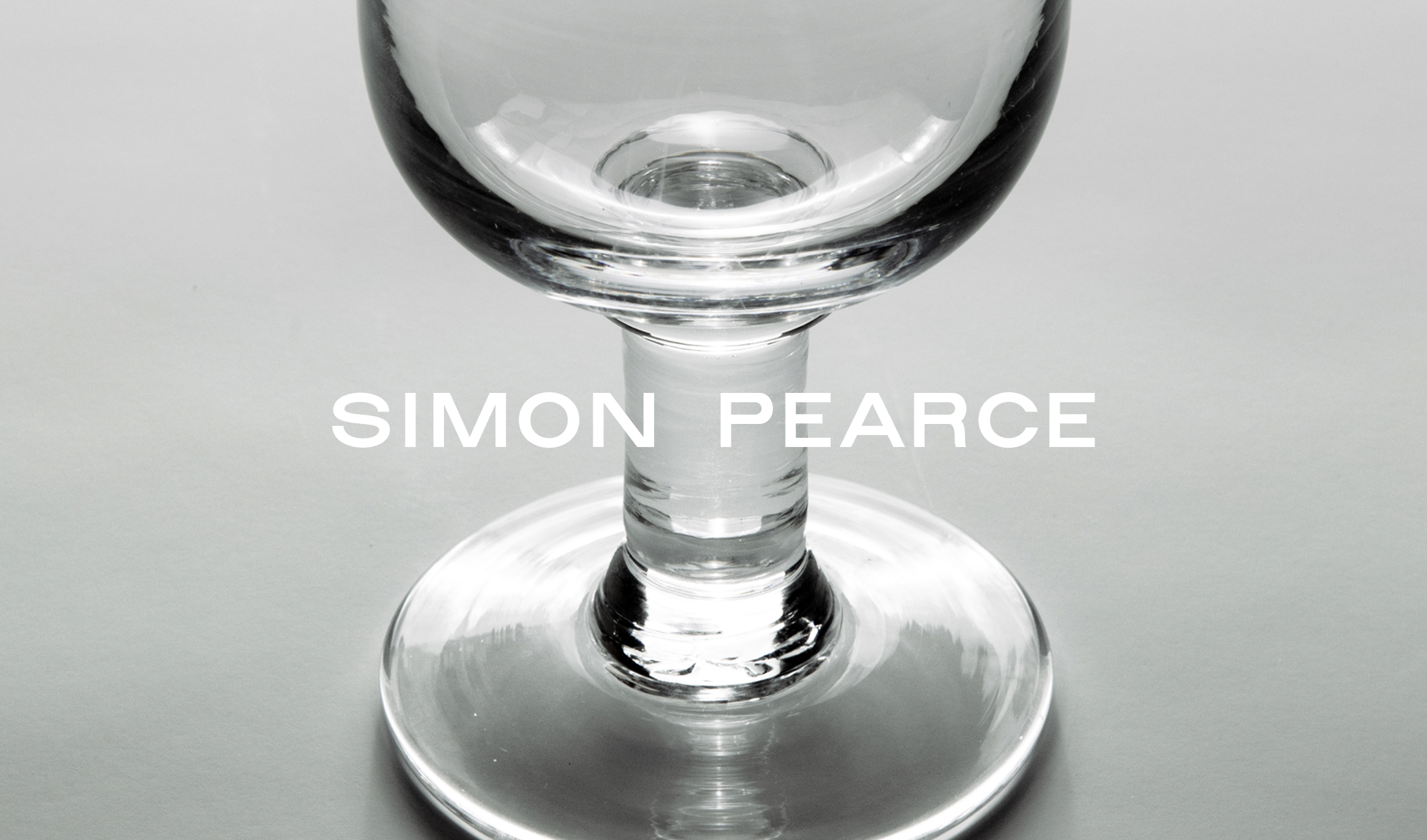
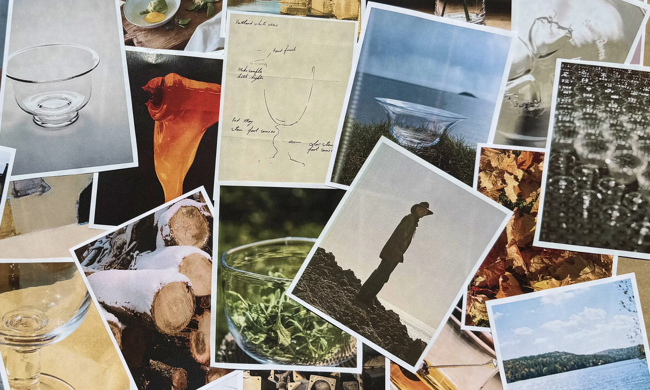
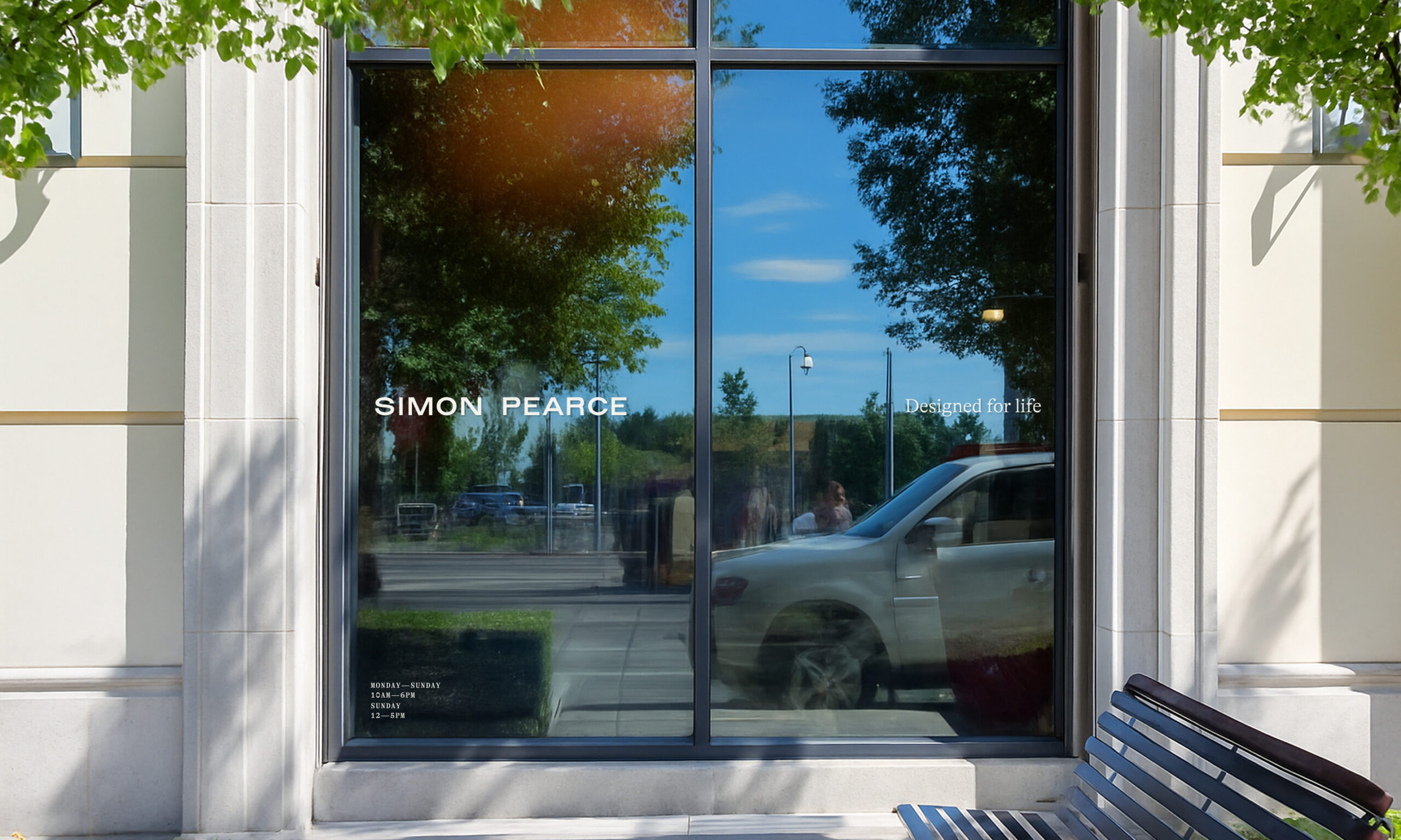
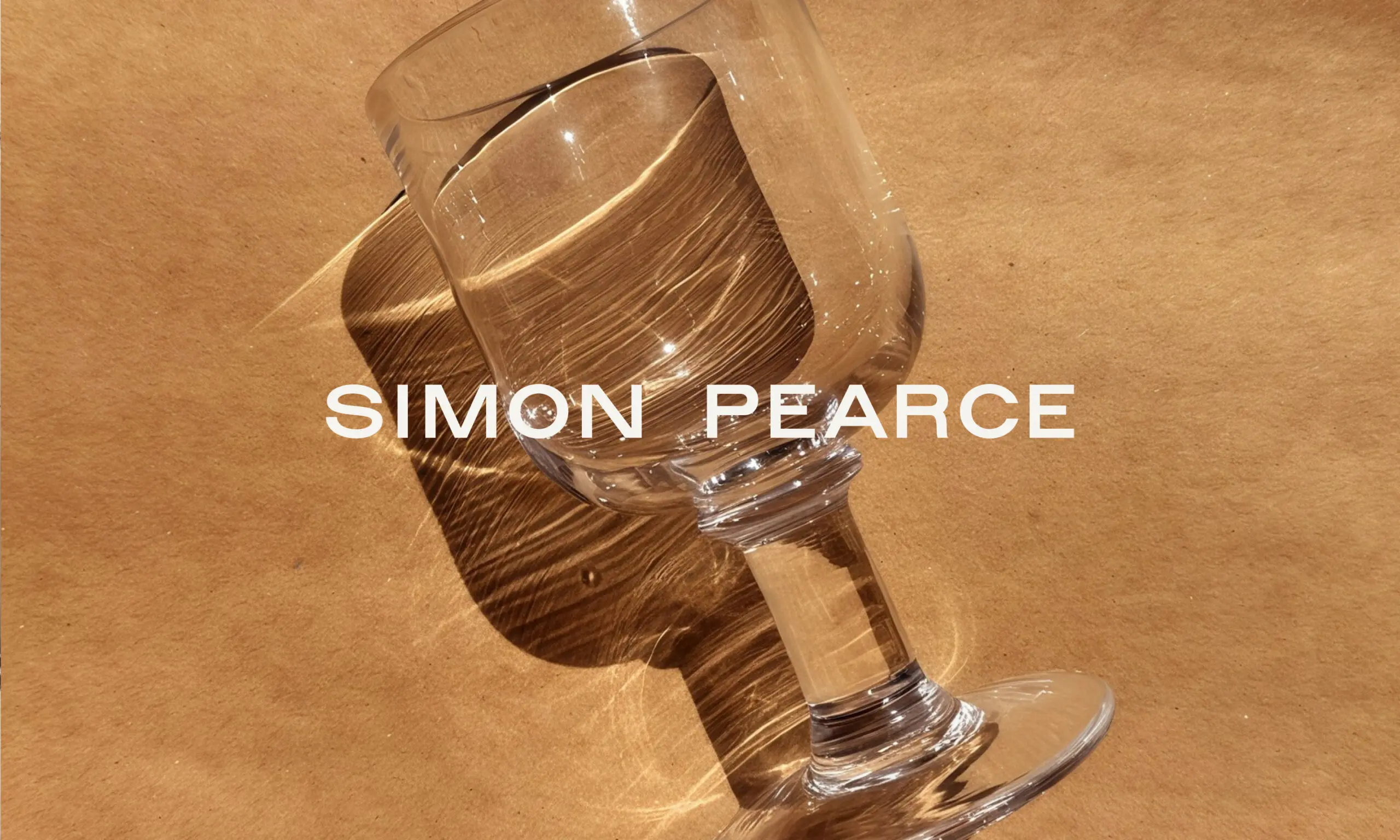
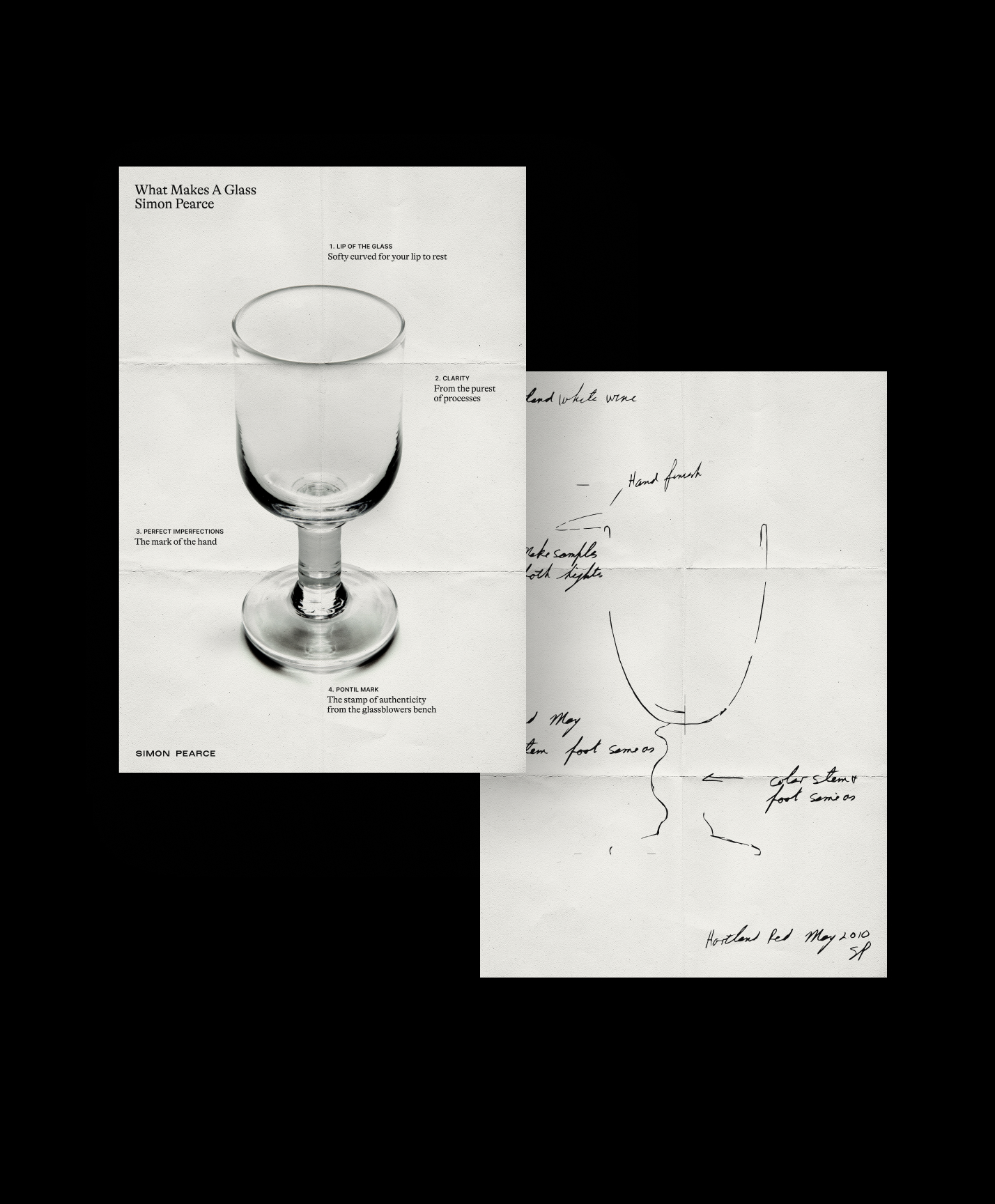
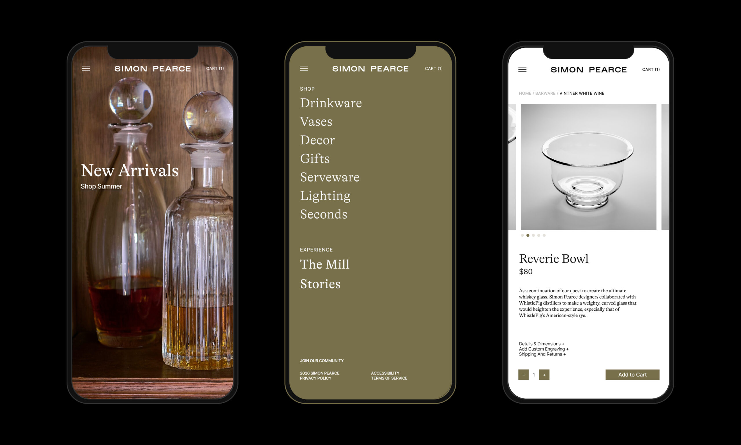
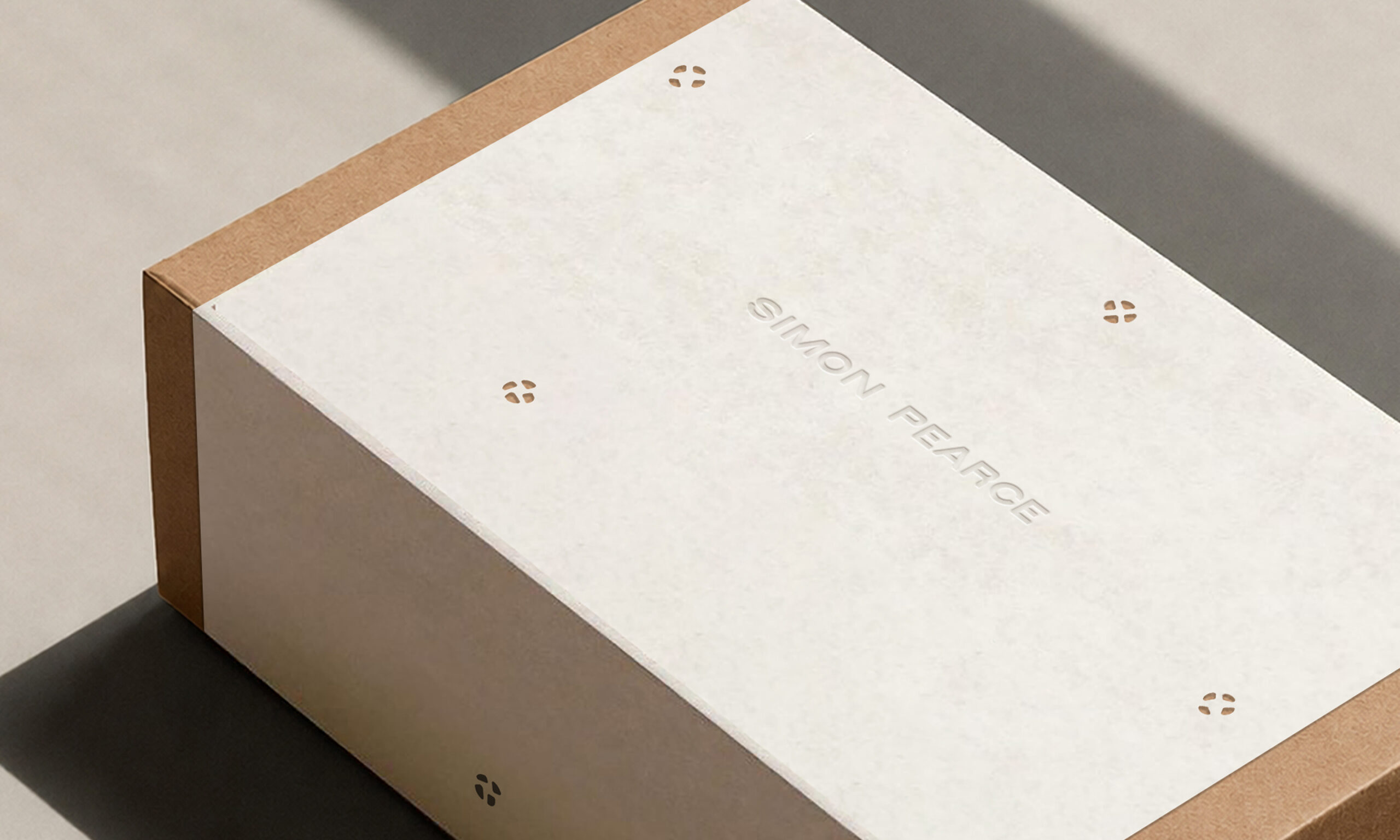
We created a wordmark drawn from the simplicity of Simon’s original Irish pottery wordmark, and the imperfect letterforms of traditional Irish shop signage. The illustrated Pontil marks, with intentional variation, reflect the same endearing and authentic quality, celebrating the beauty of objects marked by real character. Simon’s handwriting shows up across old sketches and photographs, hinting at the heritage of the brand and further reinforcing the concept of a makers mark. All of this is paired with type that balances both timeless craft and modern sensibility.
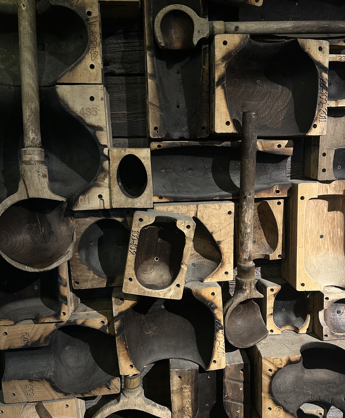
Color is strongly influenced by seasonality and moments in nature, shining through mostly in photography, with the backdrop of a neutral color palette. Balancing their humble roots without becoming too rustic, a mossy green accent enhances the connection to nature. Subtle texture and natural materials nod to the richness of craft, mimicking the warmth of glassblowing studios, and the soft natural tones of the outdoors.
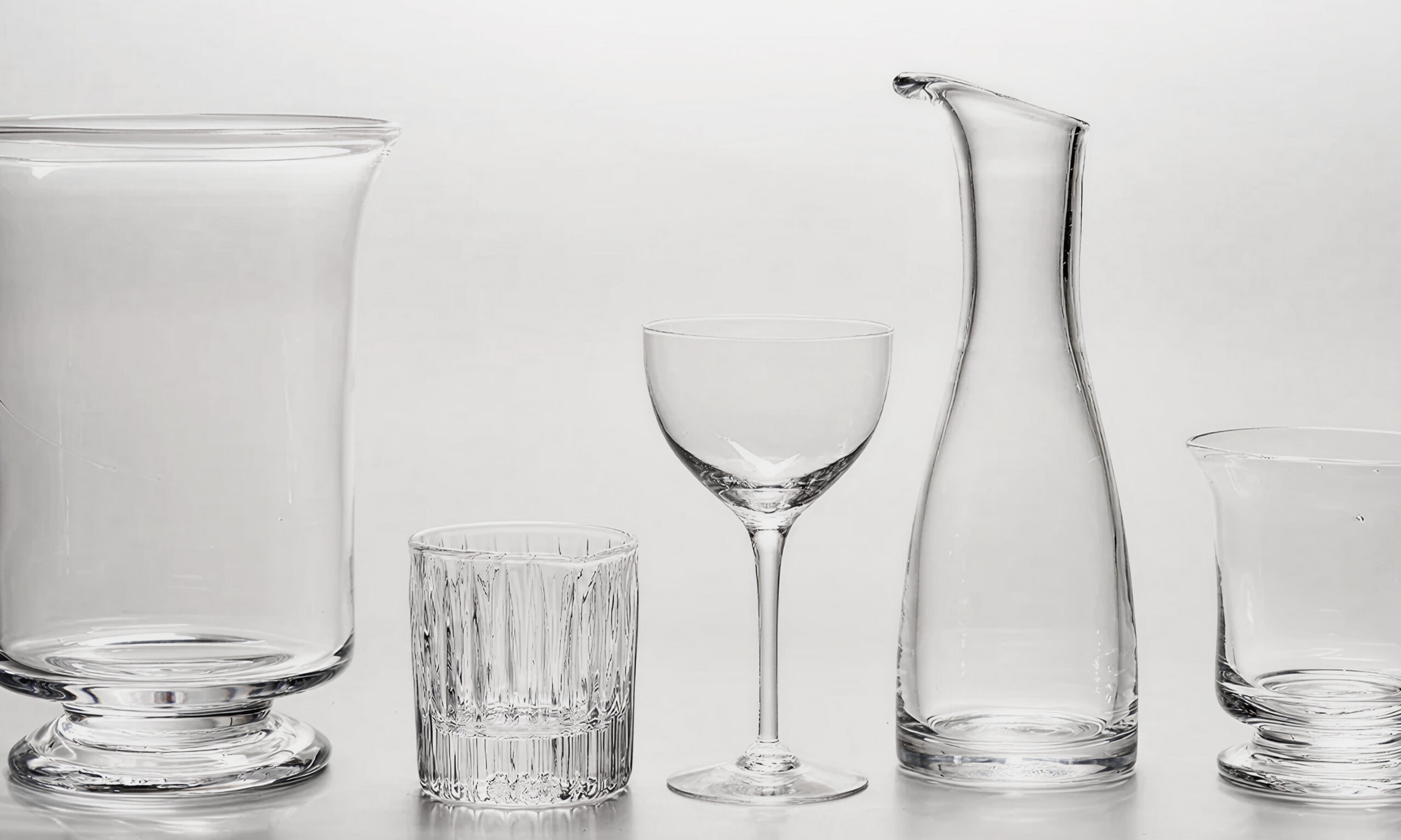
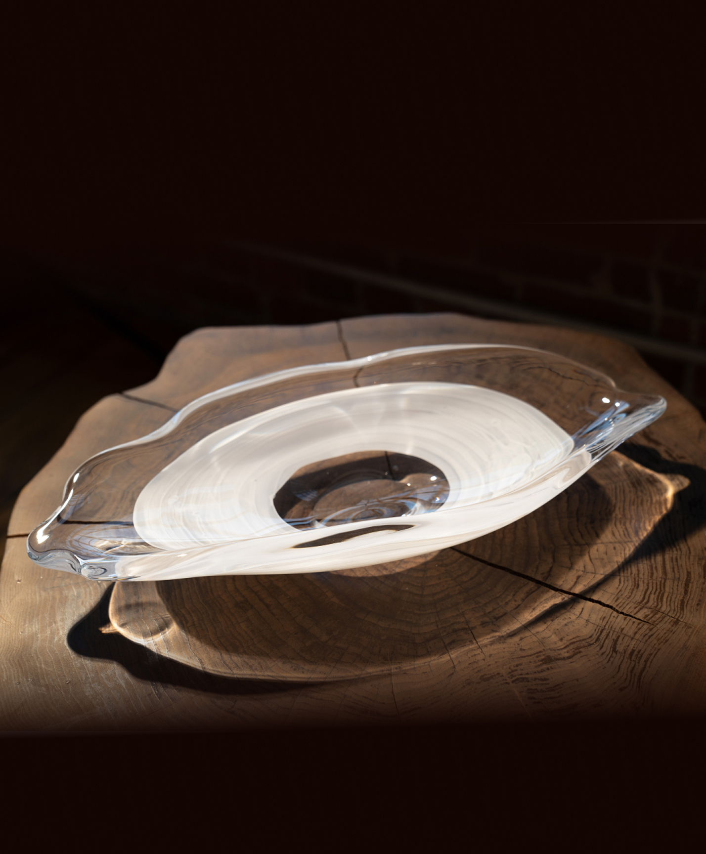
The brand’s blend of beauty and function is captured in simple, minimally propped photography. The glassware shines in natural light, seen in moments of celebration and peaceful pause, both in the studio and out in nature.
As they continue to create modern-day heirlooms, this new identity embraces the people and places that have shaped the brand from the beginning.