Members of Aruliden’s industrial design team visited Seoul this summer, meeting with clients while drawing inspiration from the city’s design trends and the character of Seoul itself.
In South Korea, the beauty and skincare industries operate at a scale that’s difficult to fully appreciate unless it’s witnessed firsthand. Since beauty and skincare have long been a core part of our client portfolio, our team was eager to absorb as much inspiration and insight as possible.
One thing we noticed immediately was the sheer depth and breadth of design in this category. From elaborate retail spaces to tasteful minimalist brands, there is something compelling for every sensibility.
Here’s a survey of what we saw in Seoul, and our take on the Korean beauty industry in 2026.
RETAIL
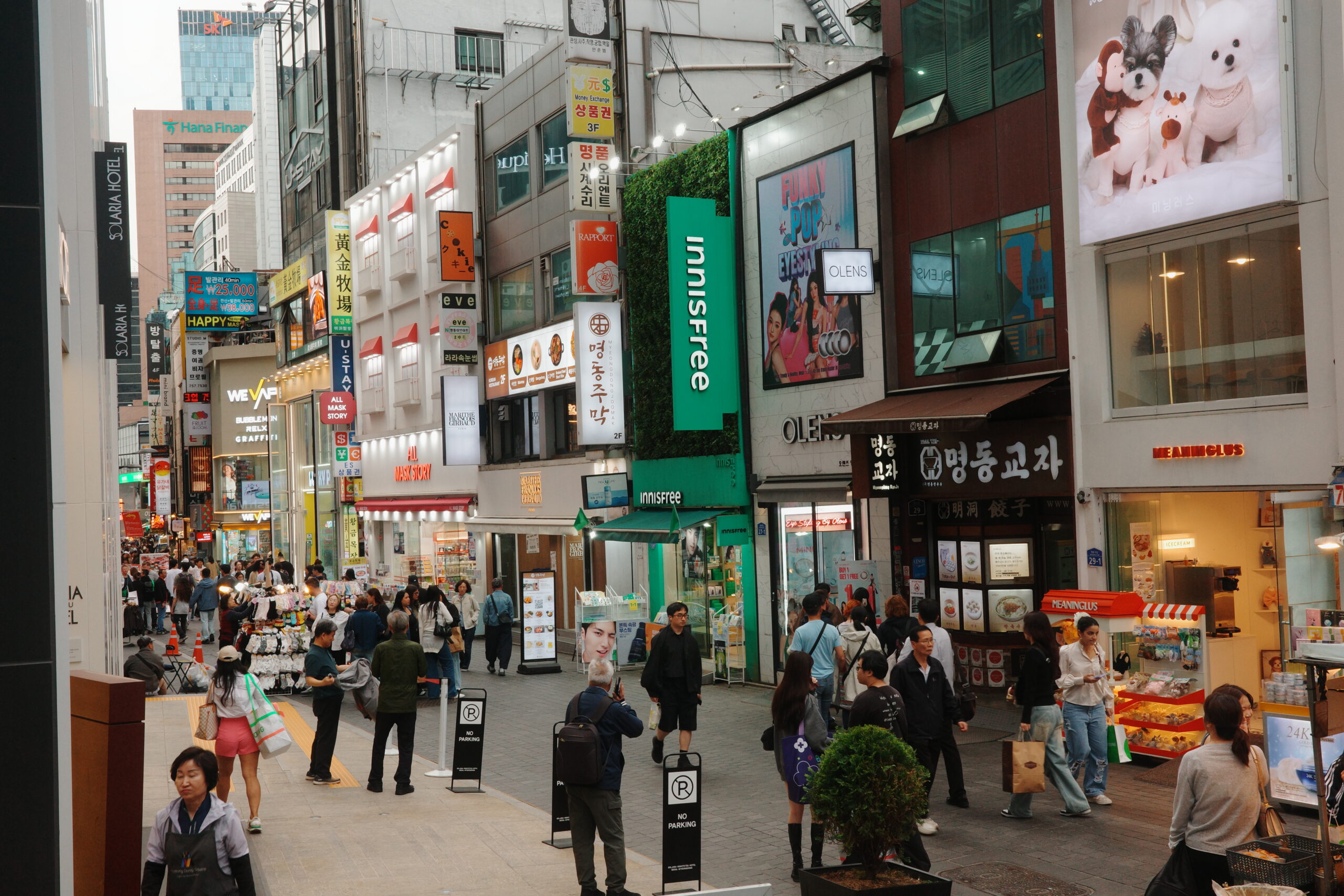
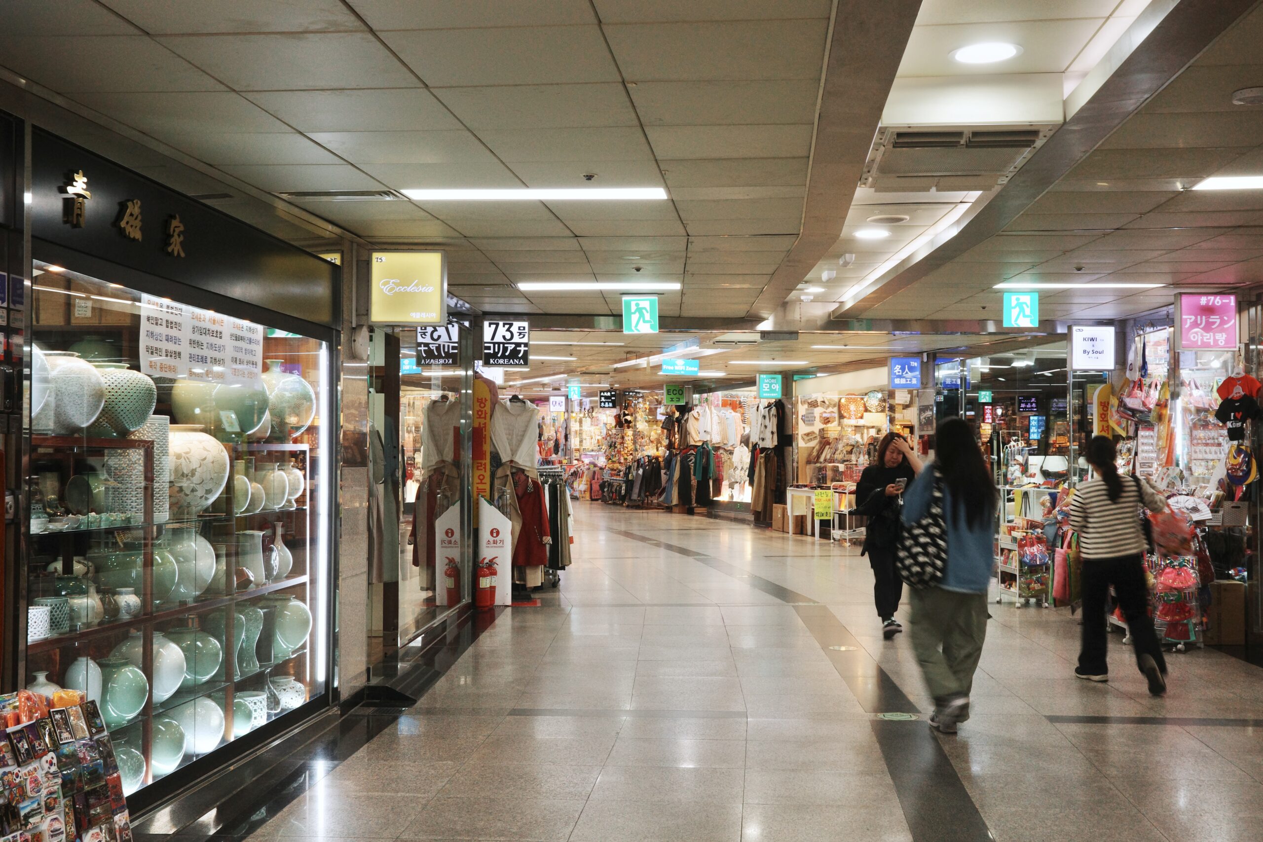
If you walk down any street in Seoul, the country’s dedication to and investment in retail is immediately apparent. The intense competition within these industries has clearly pushed brands toward an elevated baseline of quality, with a consistently high level of attention to detail, craftsmanship and overall polish.
From our perspective, beauty and skincare shopping can be grouped into a few general retail categories.
Day to Day Shops
Affordable beauty and skincare products are stocked at countless small shops including convenience stores, underground malls, street stalls and metro stations. The availability and quality of products felt worlds apart from our closest comparison back home (drugstore retail).
Multi-Brand Beauty
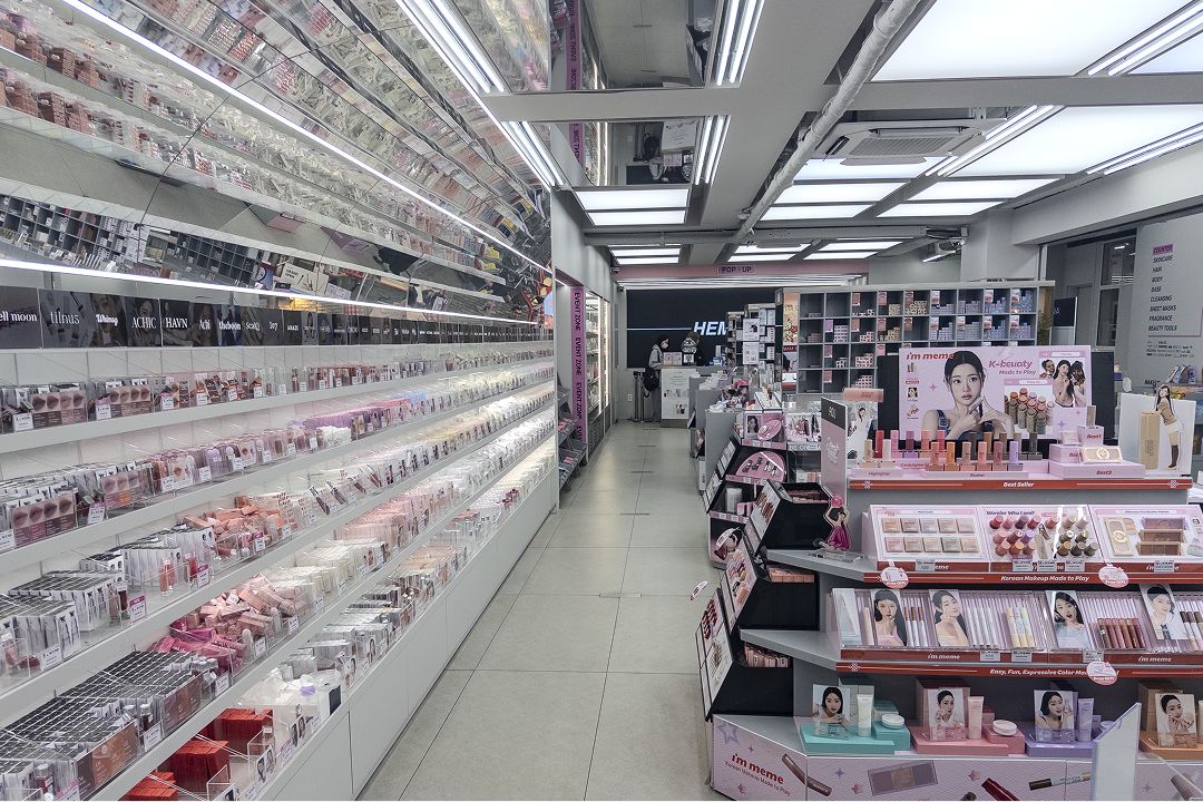
Multi-brand chains dominate as a convenient fixture of the average shopper’s life. Brands like Olive Young are workhorses for beauty shoppers, with a high number of locations, expansive product assortments and affordable pricing.
Department Stores & Flagships
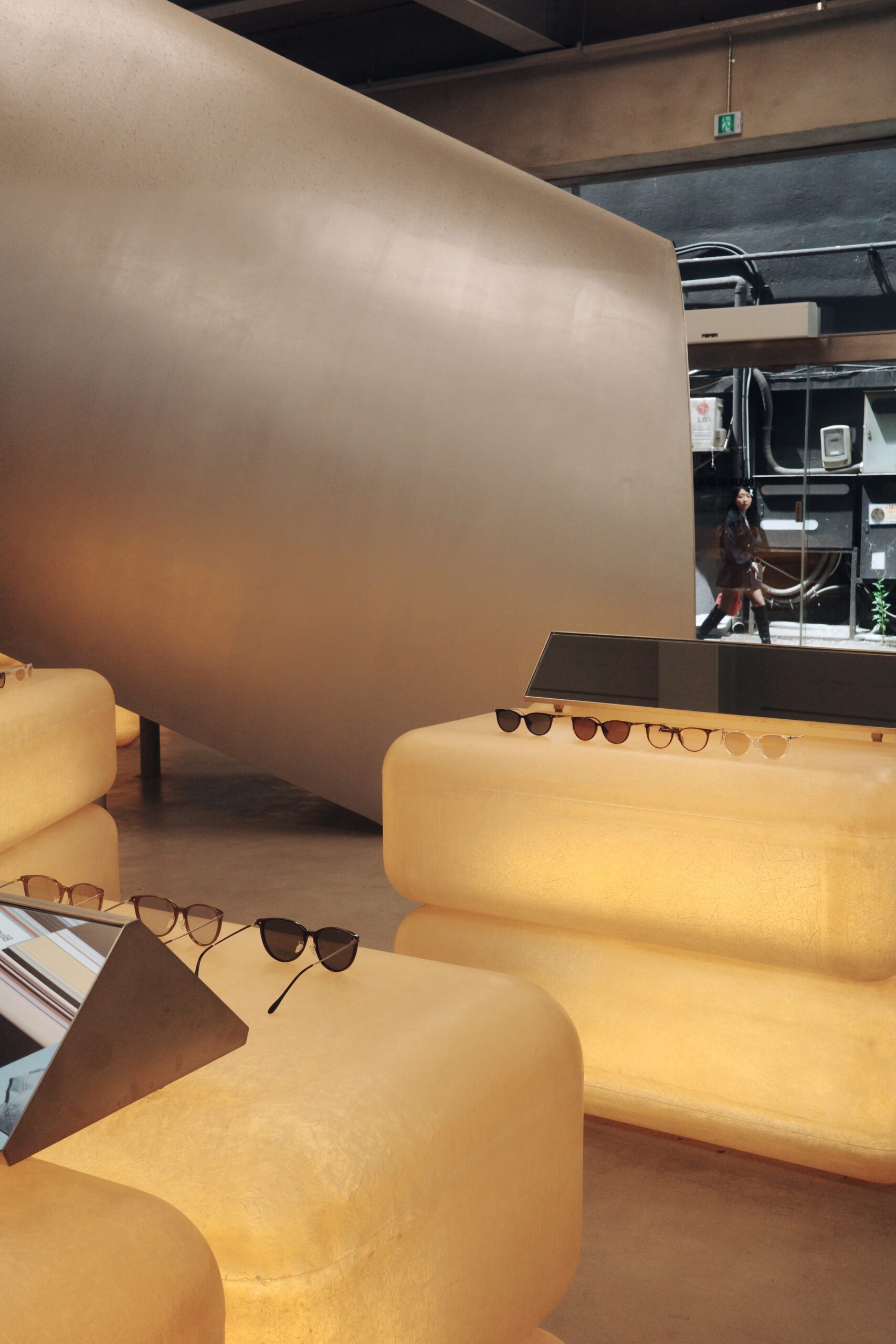
Department stores and single-brand flagship locations are where the mid- and high-end brands dominate, often investing in splashy brand installations and retail fixturing.
In these contexts, design and experience are treated as a necessary investment in the brand’s identity, especially for prestige brands or those with a carefully-crafted cool factor. This can make all the difference for standing out in a crowded, noisy industry.
Spatial Design
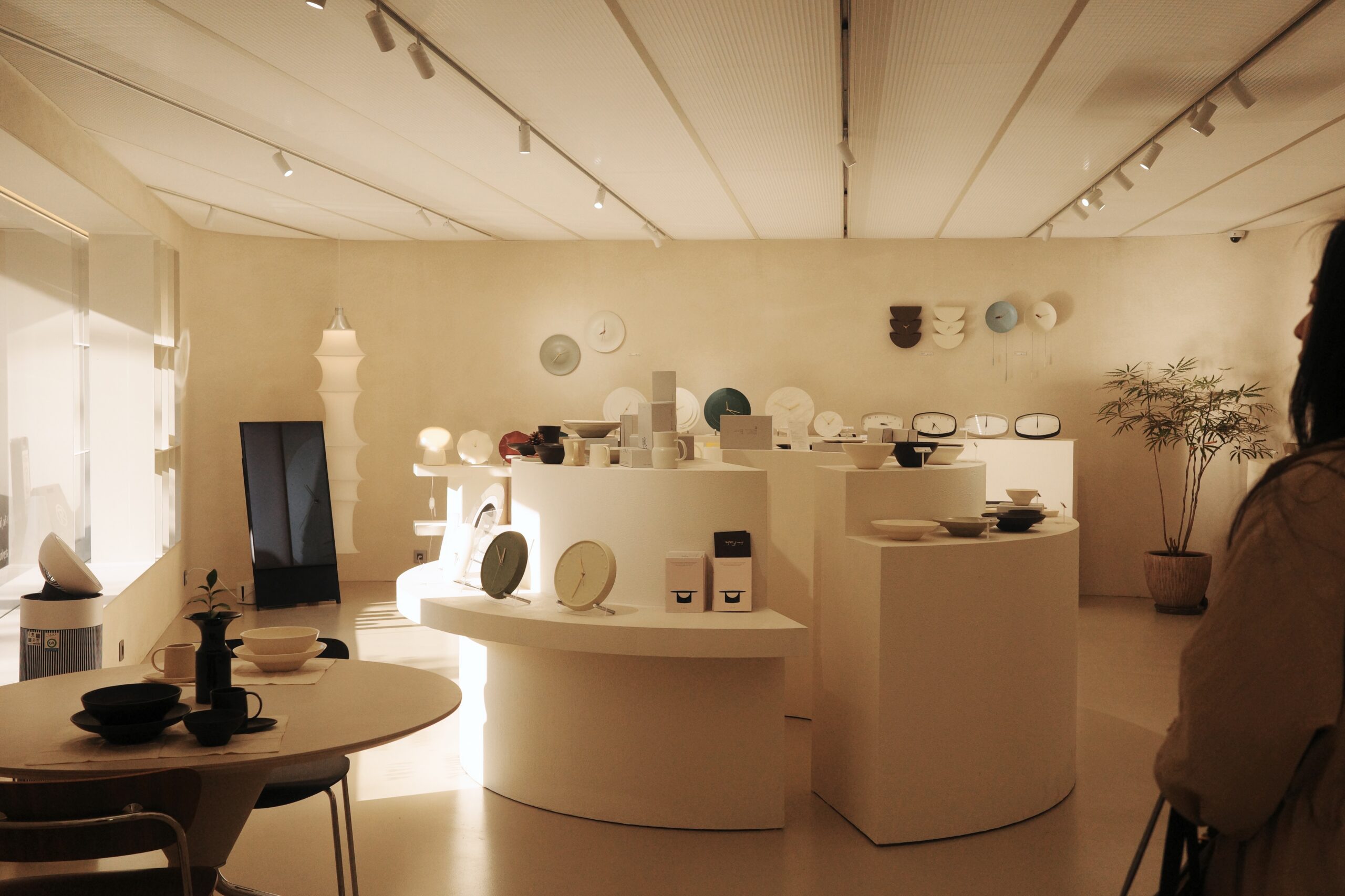
With a wide-ranging diversity of styles, there’s no single dominant trend in spatial design. But there are a few general themes we noticed.
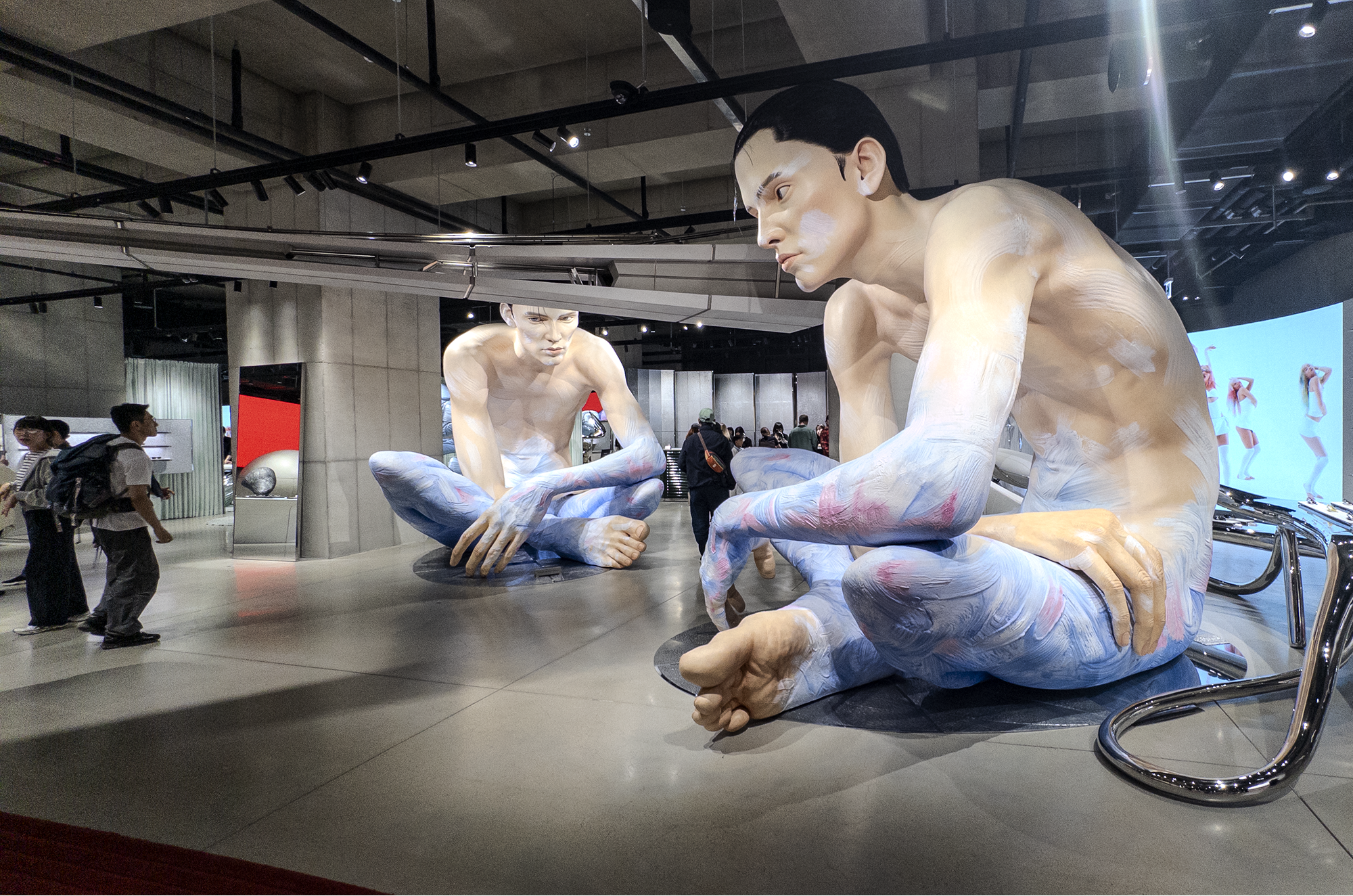
Futuristic Fantasy Worlds
Brands like Gentle Monster, Ader Error and Tamburins invite visitors into immersive installations that feel like glimpses into their own otherworldly universes. These spaces are also ever-evolving, keeping the brand fresh and giving customers a reason to return.
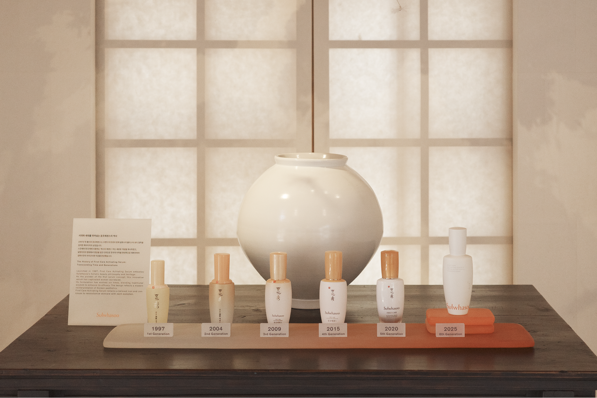
Timeless Heritage
Some brands are leaning heavily into timeless design, anchoring their philosophy in enduring, classic elements rather than trend-chasing. This can be a crucial framing for brands seeking to substantiate their formulation quality or authentic history.
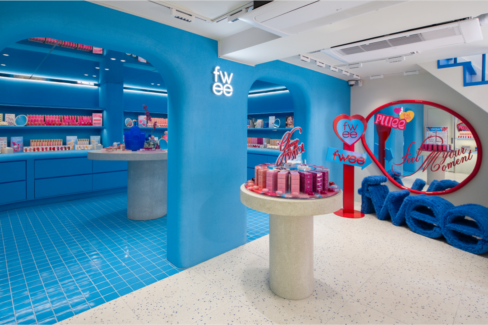
High-Energy Color Blast
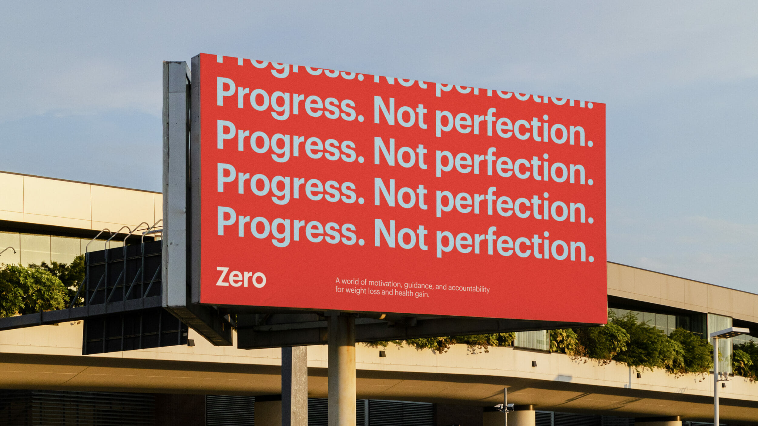
Some brands would rather shout than whisper, using spatial design as a megaphone. Brands like BORNTOSTANDOUT and Fwee use bold, saturated color palettes to create an attention-grabbing presence. Many of these brands are positioned in the medium- to low-cost tiers.
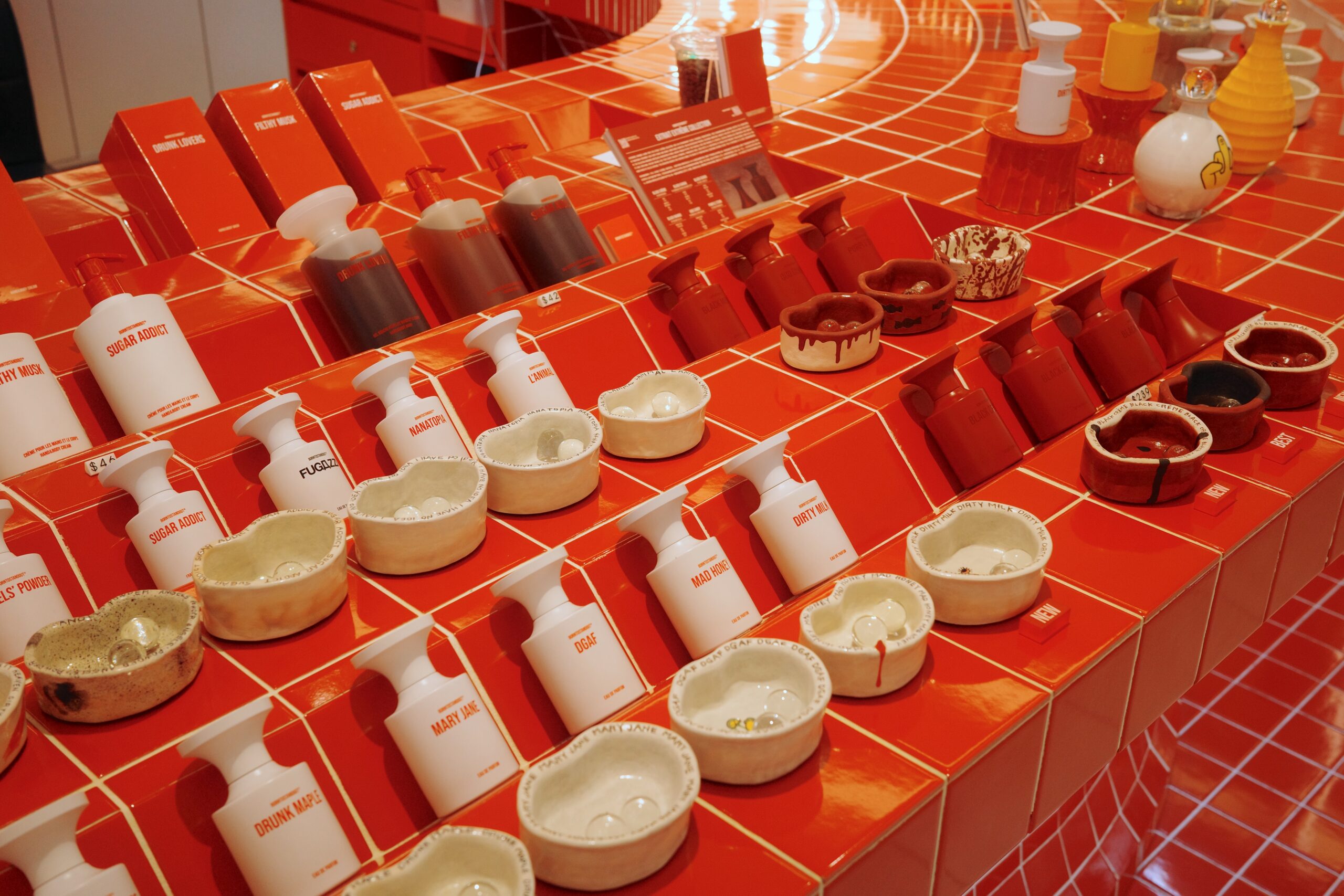
Product & Packaging Design
Packaging design trends mirror spatial design in their variety and dynamism, and recognizing a few patterns can help make sense of the market.
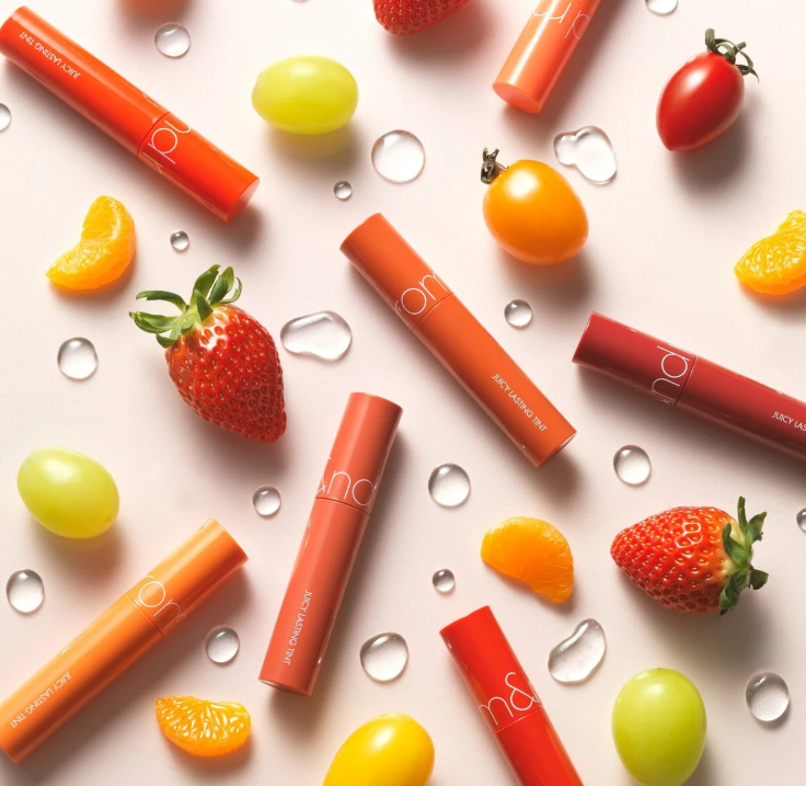
High Color Joy
Some brands prioritize playfulness and shelf presence through bright, saturated visual impressions. These brands are taking aim at a younger demographic with highly collectible and shareable packaging.
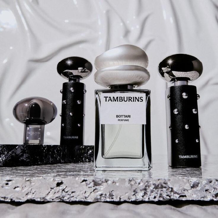
Futuristic & Surreal
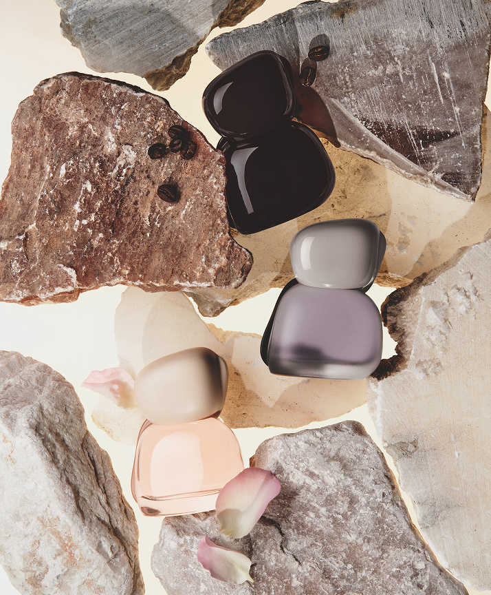
Some of the most futuristic-feeling brands lean on experimental materials and unconventional forms. These objects tell a story of a brand so future-facing that it exists in its own universe; so advanced and stylish it looks unlike anything seen before.
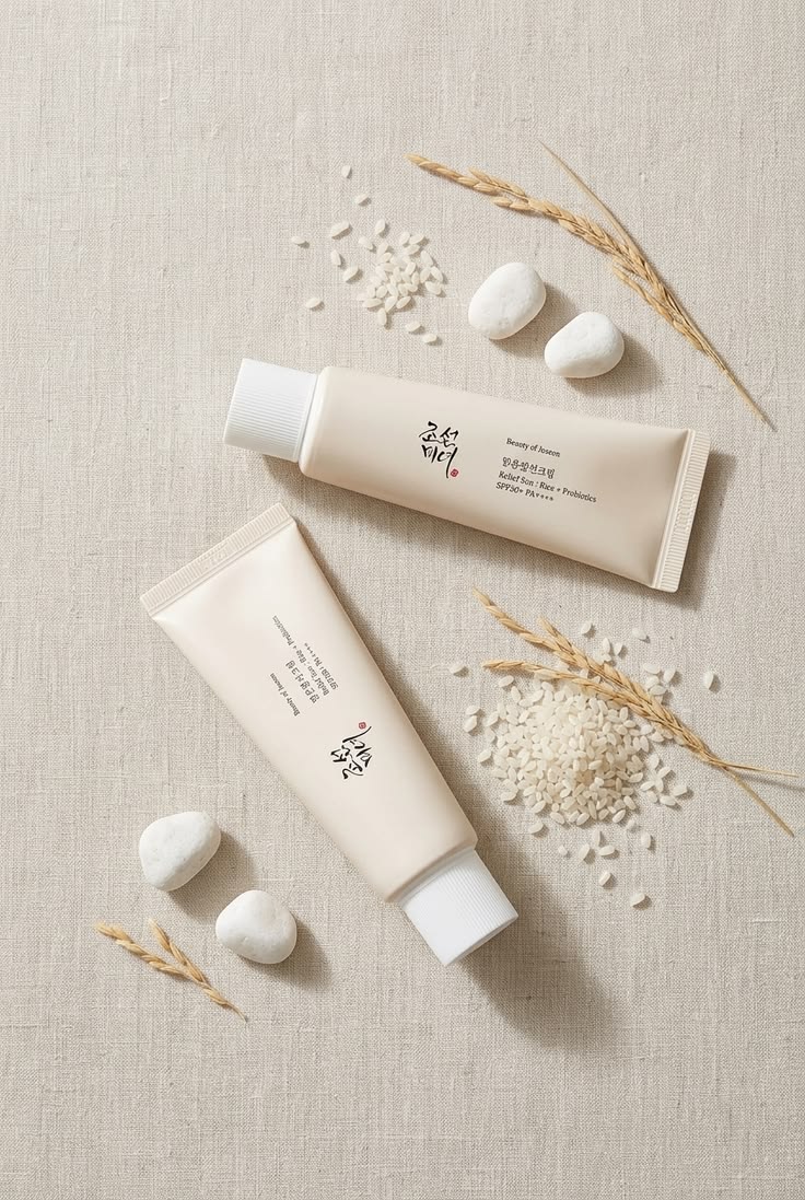
Classic & Refined
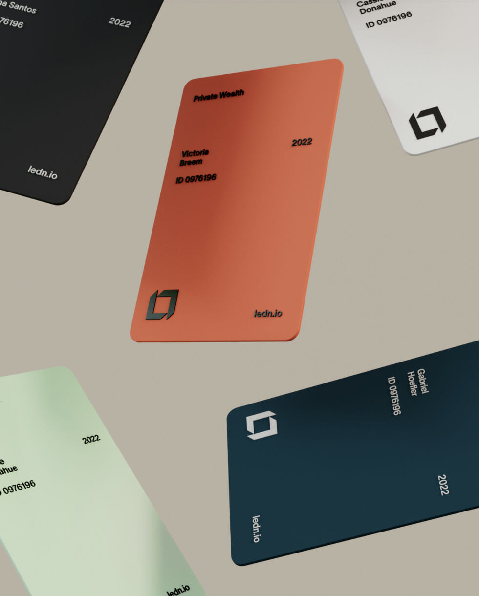
Standing in contrast to these trends are brands that want to convey a sense of credibility or longevity. Design details tend toward clean typography, muted palettes and soothing materials, with a focus on quality over spectacle.
In general, there is a notably different approach on merchandising and product assortment vs. what we see in the USA. Korea’s approach to color cosmetics emphasizes subtlety and precision, with palettes that favor muted tones and nuanced shade variations. The U.S. market, by contrast, often leans toward bold, highly pigmented formulas with a wider range of vibrant color options.
What It All Means
In crowded categories from skincare to fashion, differentiation comes from the entire customer experience, not just the product itself. Design, storytelling, packaging and retail environments all play a role in helping brands stand out. In Korea, trends within these industries can move at an exceptionally fast pace, and consumers remain highly engaged with what’s new. This creates an environment where brands can rapidly test, iterate and respond to changing preferences. That cycle of iteration continues to compress and accelerate.
At the same time, the speed of these trend cycles can encourage conformity. While staying current is important, one of our main takeaways is the value of balancing trend relevance with a stable brand identity and point of view. The brands that stood out the most to us felt authentic—whether futuristic, heritage or something in between—rather than simply following the latest trend.
We’re curious how this will play out in the long term. Some members of the younger generations are starting to reject always-online, short-form culture in favor of CD players, dumbphones, film cameras and genuine connection. These emotional values could eventually converge with brand preferences, and the “quiet” brands might cut through the noise regardless of aesthetics.
For brands and designers in the USA, it’s worth taking a closer look at how Korean culture manages to simultaneously enable a faster trend cycle and a higher baseline of quality. Part of it, we believe, comes down to investment—a Gentle Monster-caliber store experience doesn’t happen without serious funding. The products themselves benefit from logistics, as Korean designers draw on a vast and impressive supply chain close to home. And consumer education fuels the entire engine: a highly knowledgeable, on-trend user base will always be on the lookout for what’s next.
We can’t wait for another excuse to head back to Seoul. If you’d like to discuss what this might mean for your brand, reach out. We’d love to compare notes and explore what’s next together.