Supergoop!
- Visual Identity
- Art Direction
- Packaging


Supergoop!
- Visual Identity
- Art Direction
- Packaging
- Brand Architecture
- Content Creation
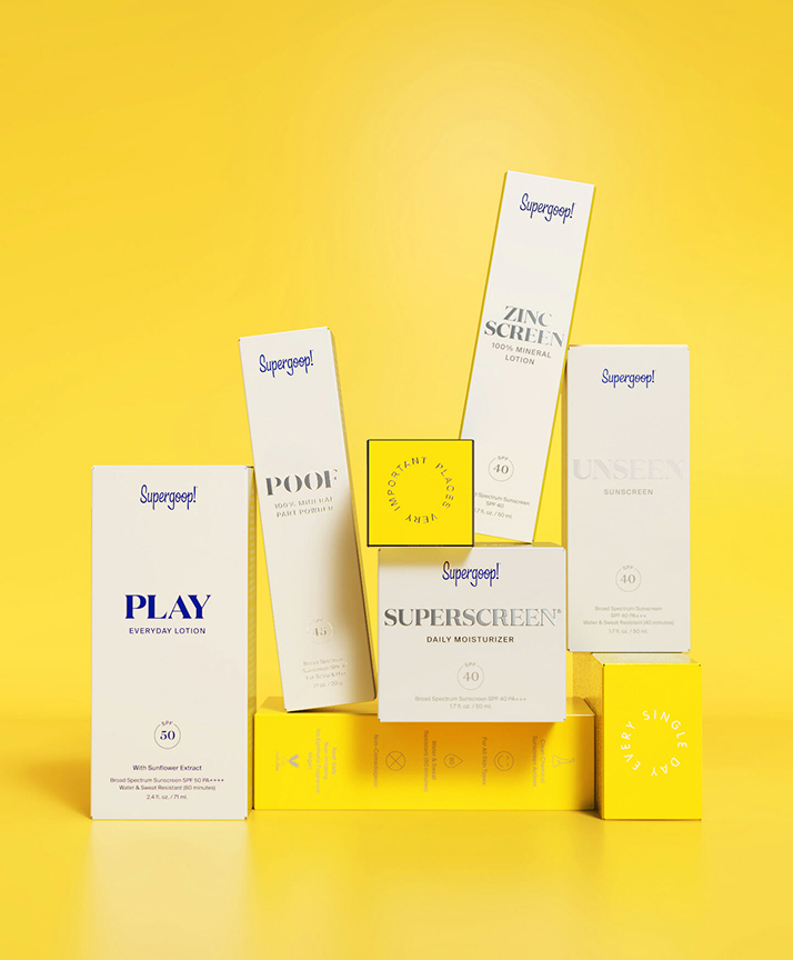
Supergoop! partnered with Aruliden to evolve its brand and packaging architecture while reinforcing its mission to “Live Bright! Every. Single. Day.” The system introduces clarity across the product portfolio while maintaining the brand’s playful, optimistic spirit.
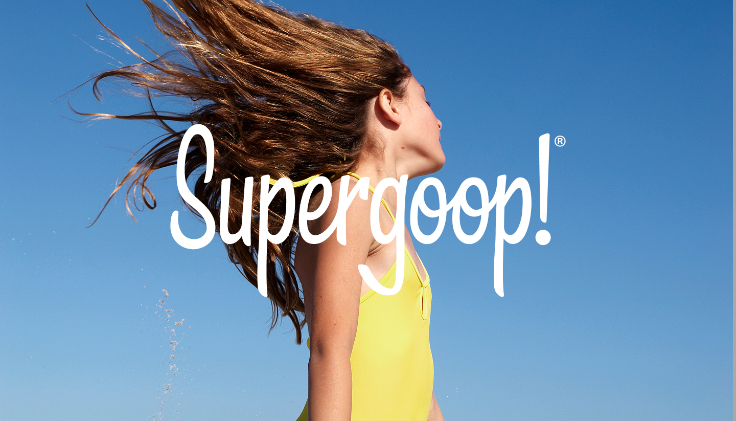
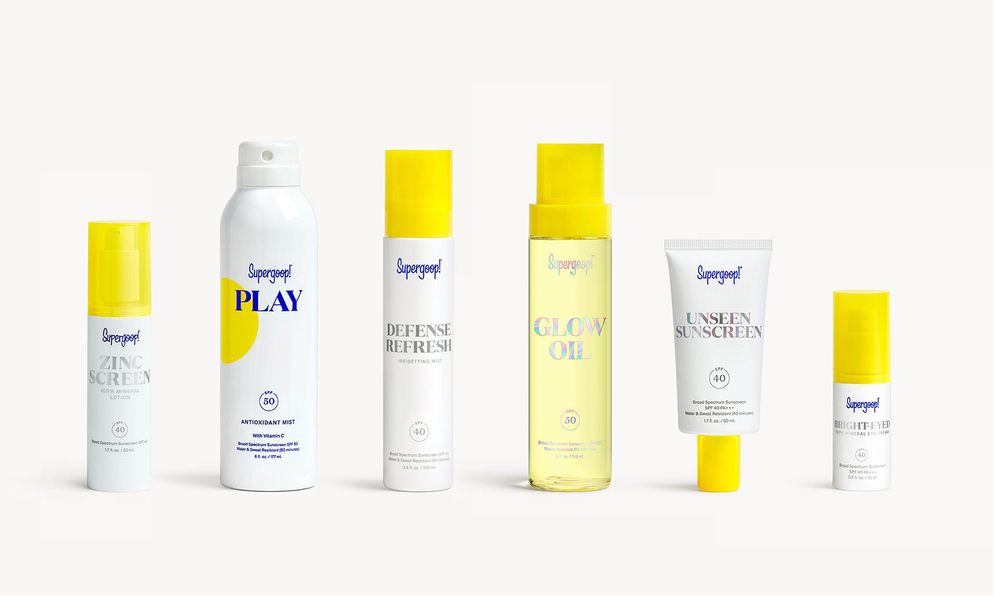
Evoking the feeling of a warm, sunny day, the identity, packaging system, and GTM approach embody the brand promise of ‘Live Bright,’ bringing vibrancy and trustworthiness to a range of everyday SPF solutions that nurture your skin.
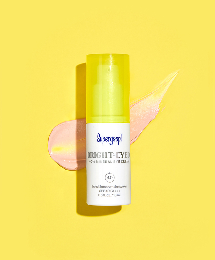
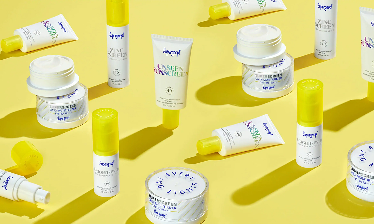
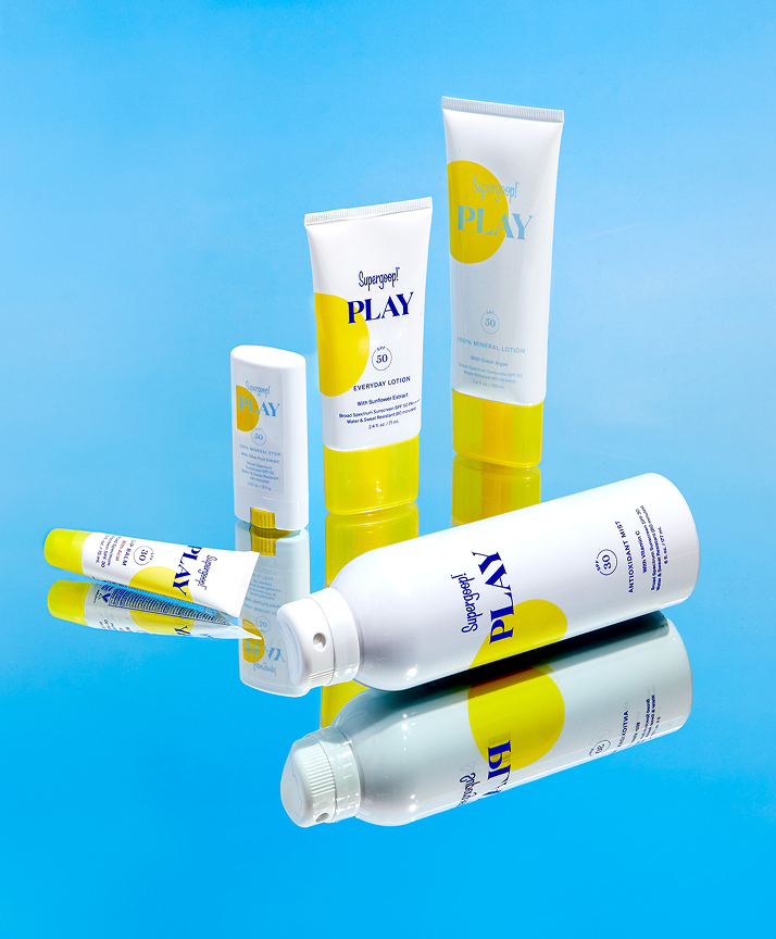
The new system consistently elevates Supergoop!’s most ownable assets: the sunny pop of yellow, the fashionable serif font, the unique wordmark and, of course, SPF. Slight variations in finish, graphic elements and color clarify different product families, while creating coherence across the full line up.
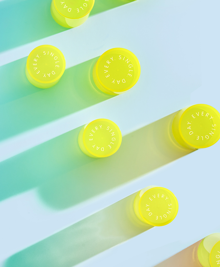
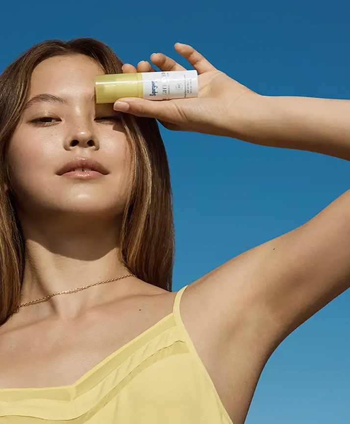
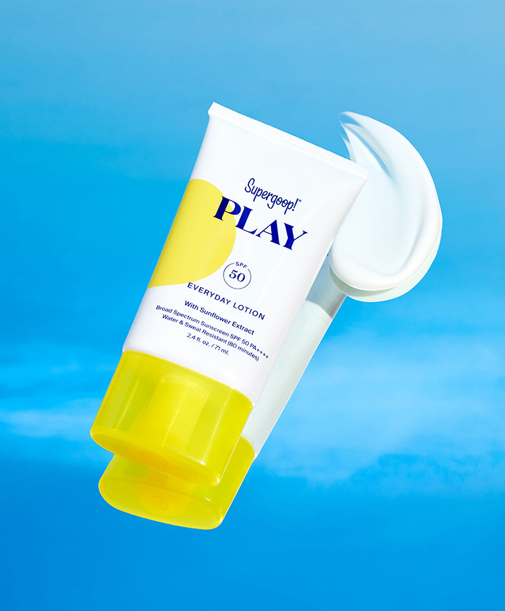
With Supergoop!, sun is always welcome. The brand’s lifestyle and product photography uses natural light to create a sense of vibrancy, depth and everyday authenticity. In moments, the sun itself becomes a character: peeking through, throwing shadows, adding movement.