QUAY
- Brand Strategy
- Visual Identity
- Campaign




QUAY
- Brand Strategy
- Visual Identity
- Verbal Identity
- Art Direction
- Motion
- Campaign
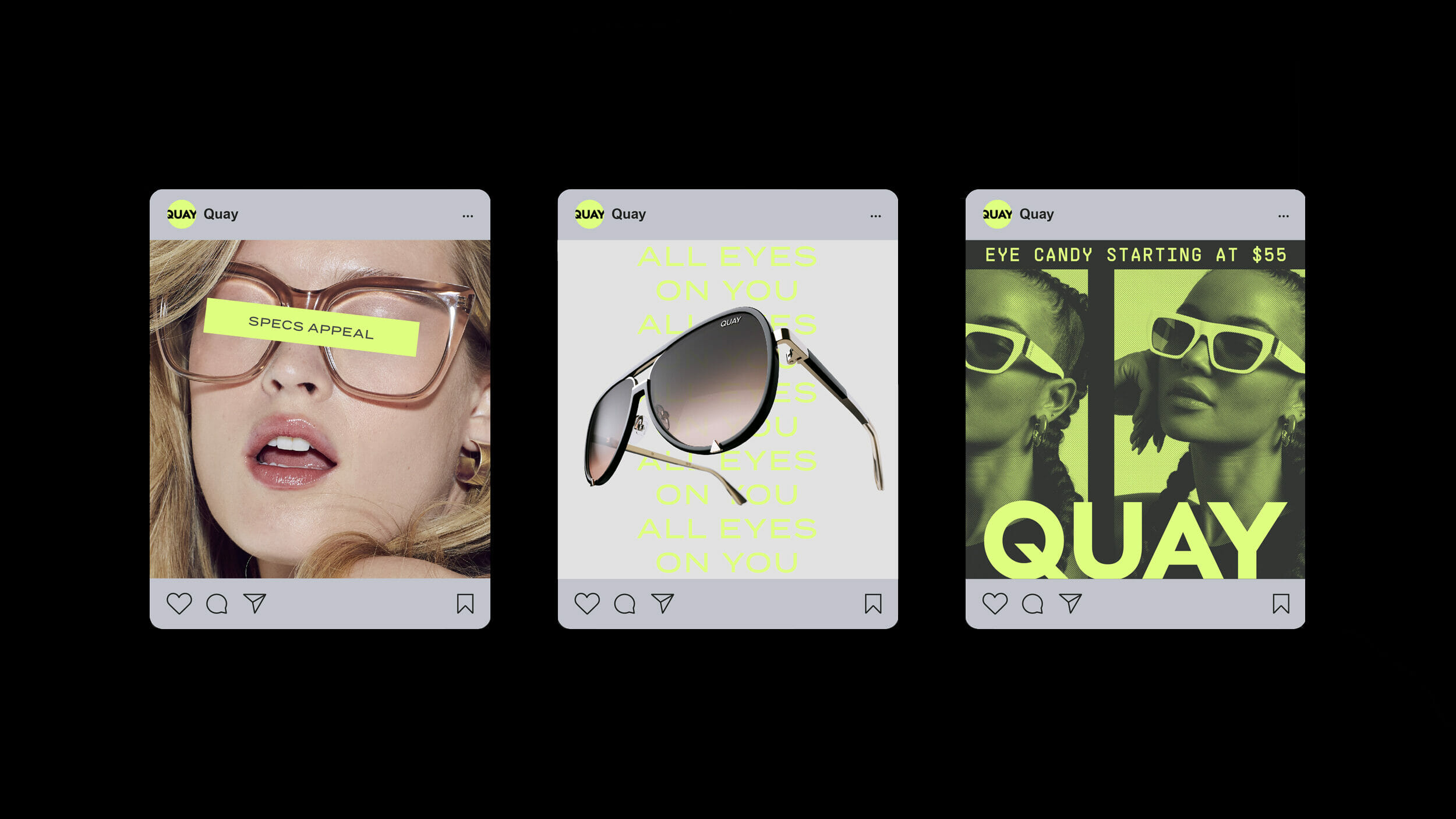
Aruliden partnered with Quay to refine the brand’s positioning, evolve its visual identity, and develop a breakthrough campaign for their relaunch. The goal was to inject the energy and attitude of sunglasses culture into the traditionally functional optical category while embracing Quay’s signature sense of playful glamour.
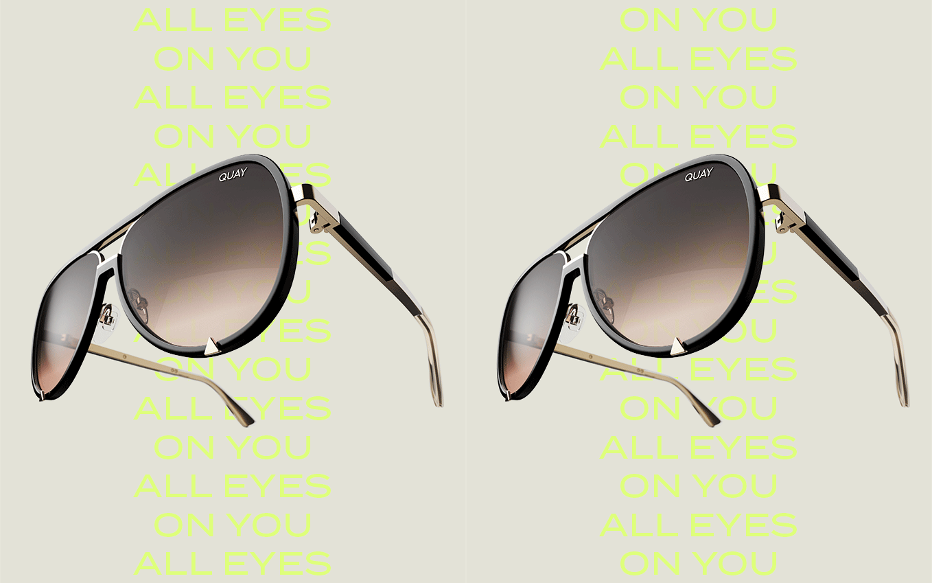
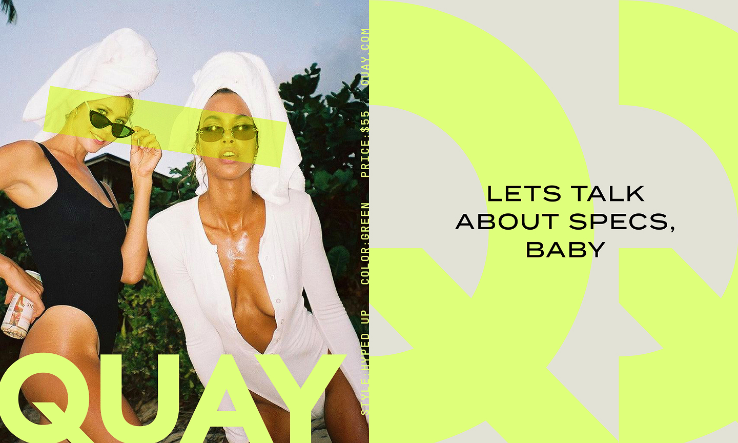
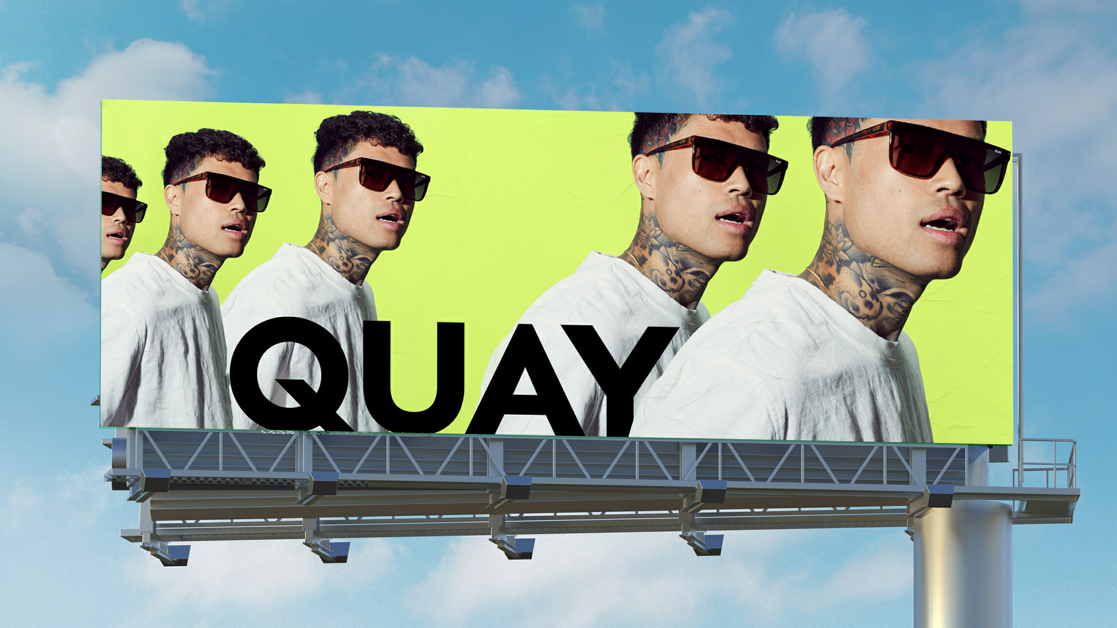
As the brand evolved, we simplified the visual and verbal identity to amplify its larger-than-life positioning: “Quay is here to Turn You On.” A streamlined logo system, enlarged cropped Q mark, and signature Quay Lime color introduce boldness and attitude into a minimal framework designed to spotlight both the wearer and the product.
Extending across digital, social, and connected TV platforms, the relaunch campaign channels high-energy confidence and transforms everyday city streets into celebrations of self-expression, individuality, and personal style.