Mienne
- Brand Strategy
- Visual Identity
- Industrial Design
Mienne
- Brand Strategy
- Visual Identity
- Industrial Design
- Packaging Design
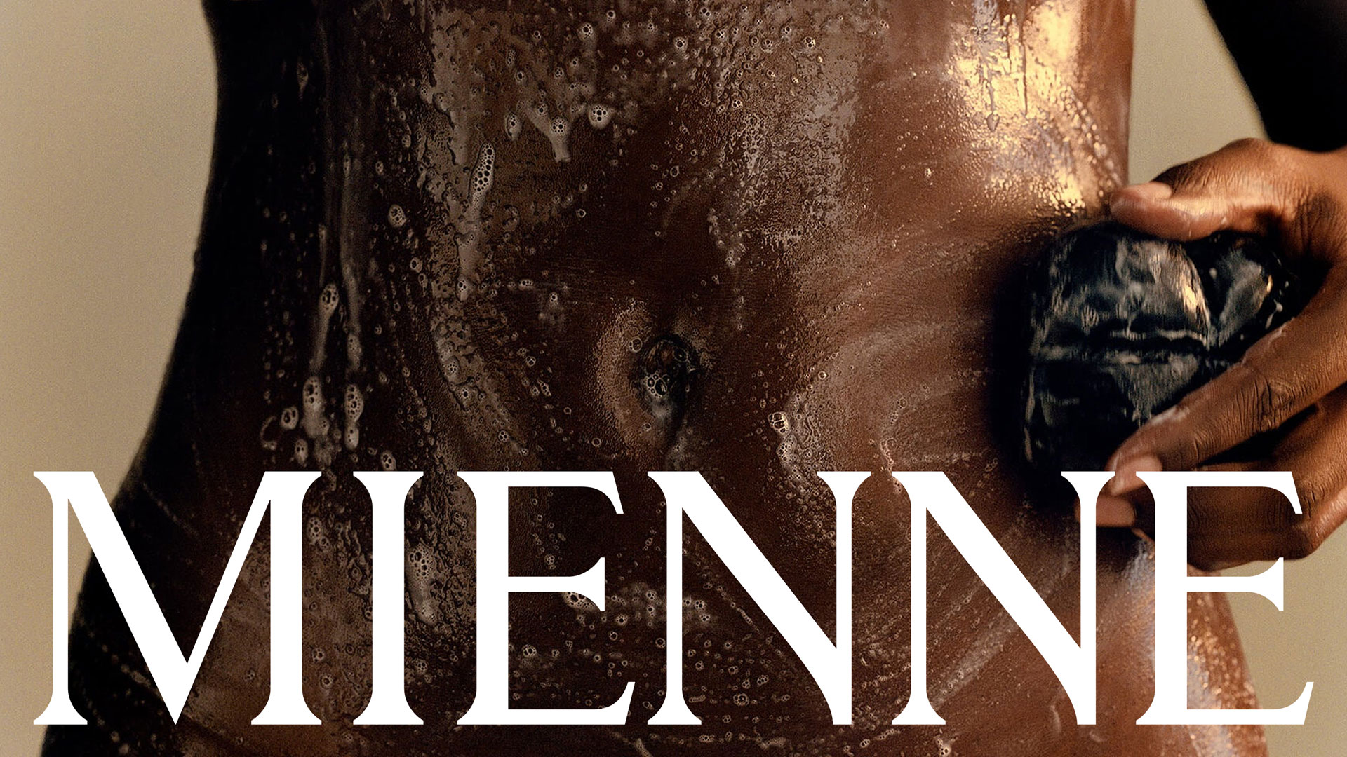
Mienne fills the gap between fantasy and reality, inviting luxury consumers to explore their desires within an intimacy category that has become increasingly sexless and bland. The challenge was to reinvigorate bodycare and intimacy products with passion, reverence for the body, and a sense of elevated eroticism.
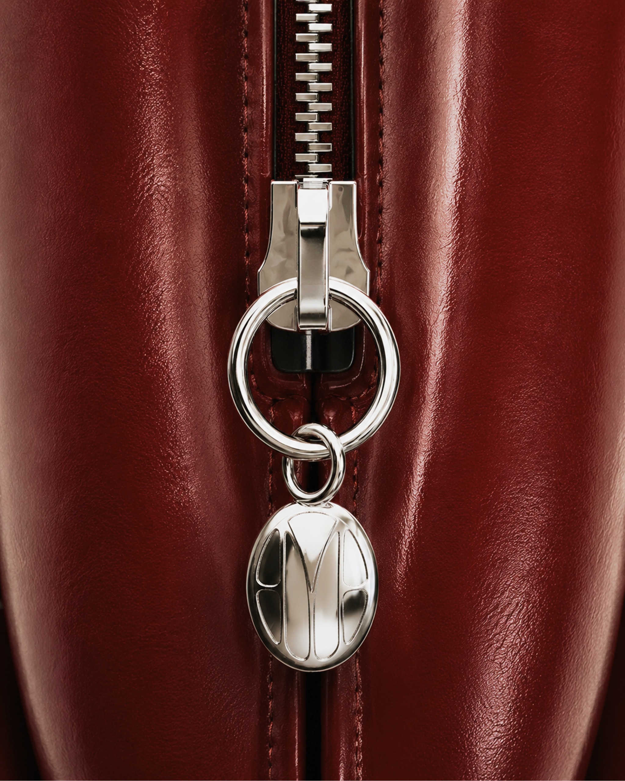
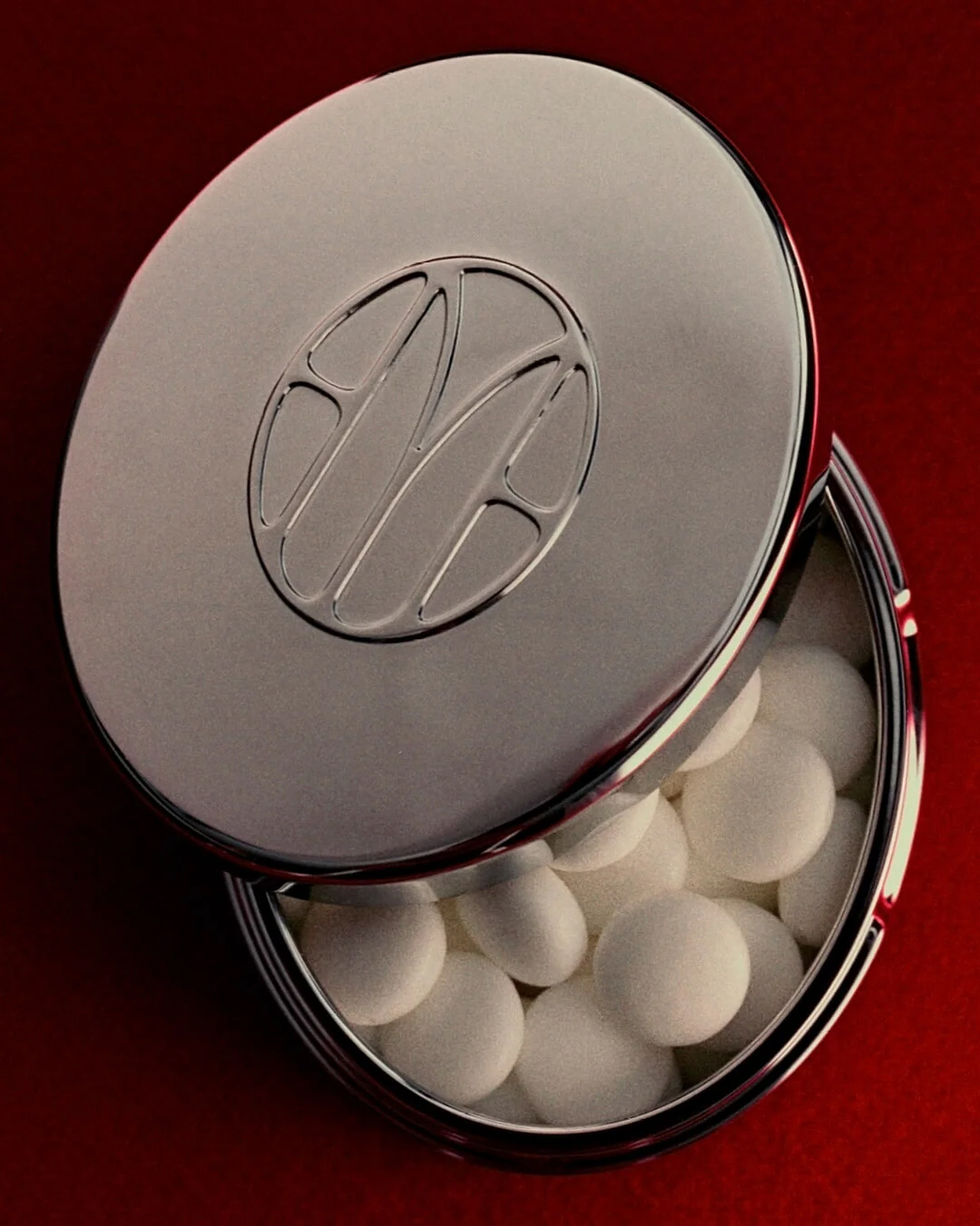
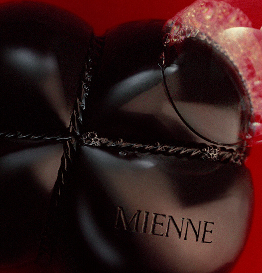
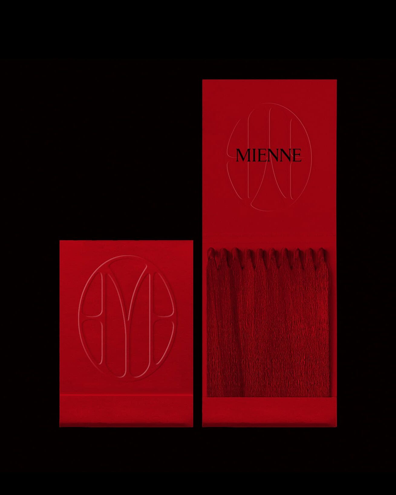
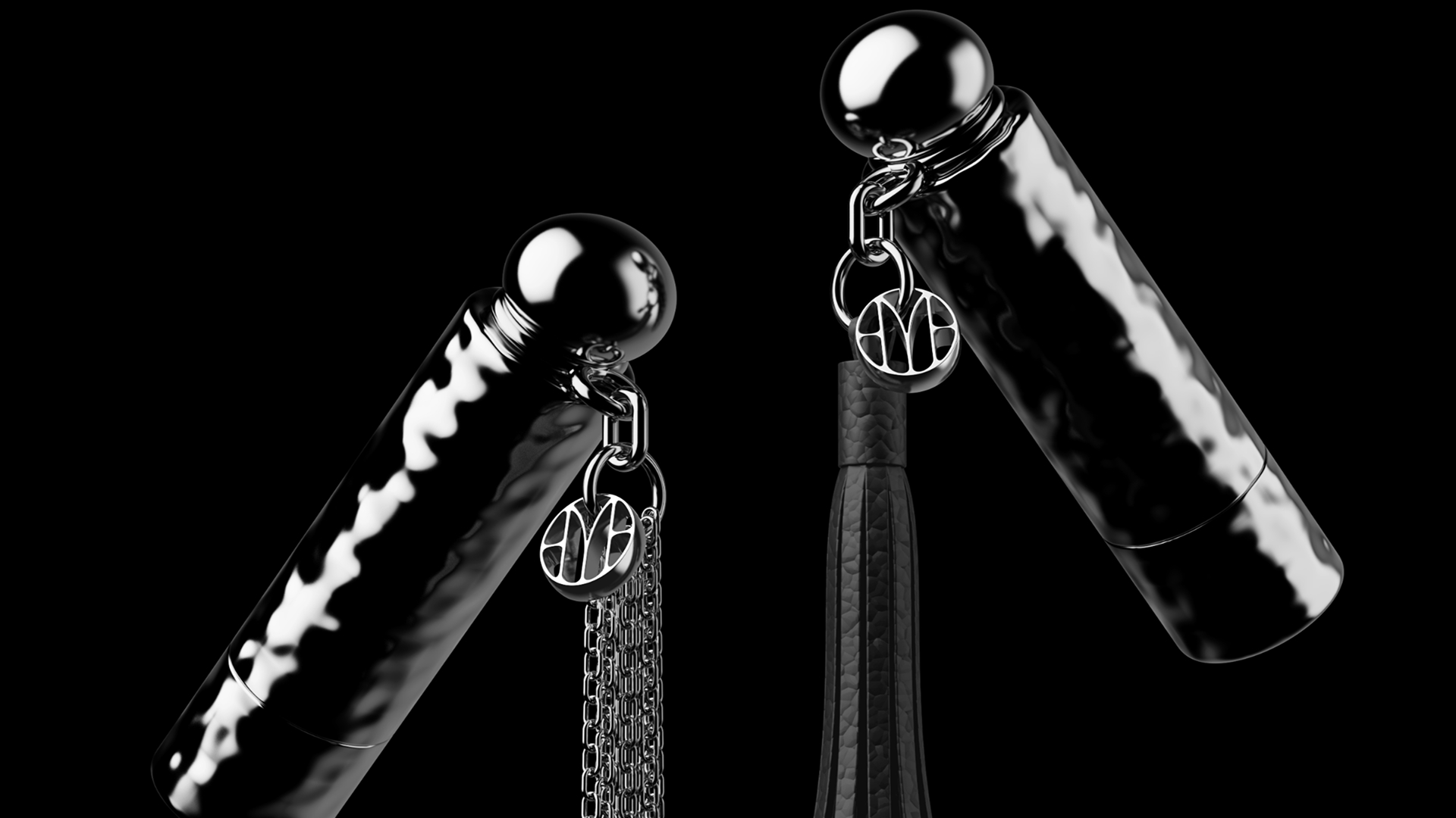
The design process began with innuendo—forms that drip, shapes with tension, and colors drawn from lust and leather. The logo blends fashion cues with fluid dynamics, with Mienne’s signature “M” bleeding at the edges as it clings to its oval monogram container.
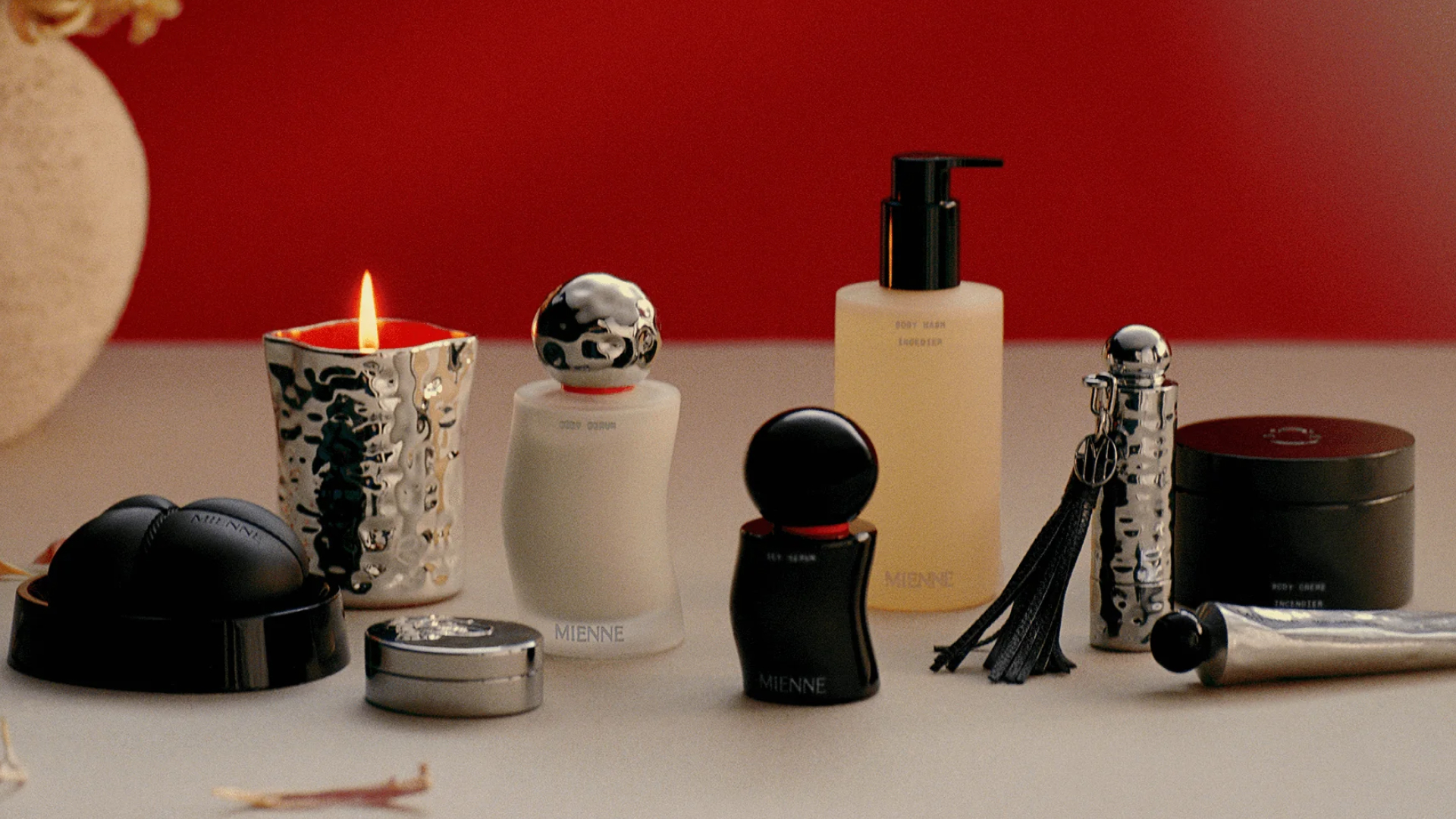
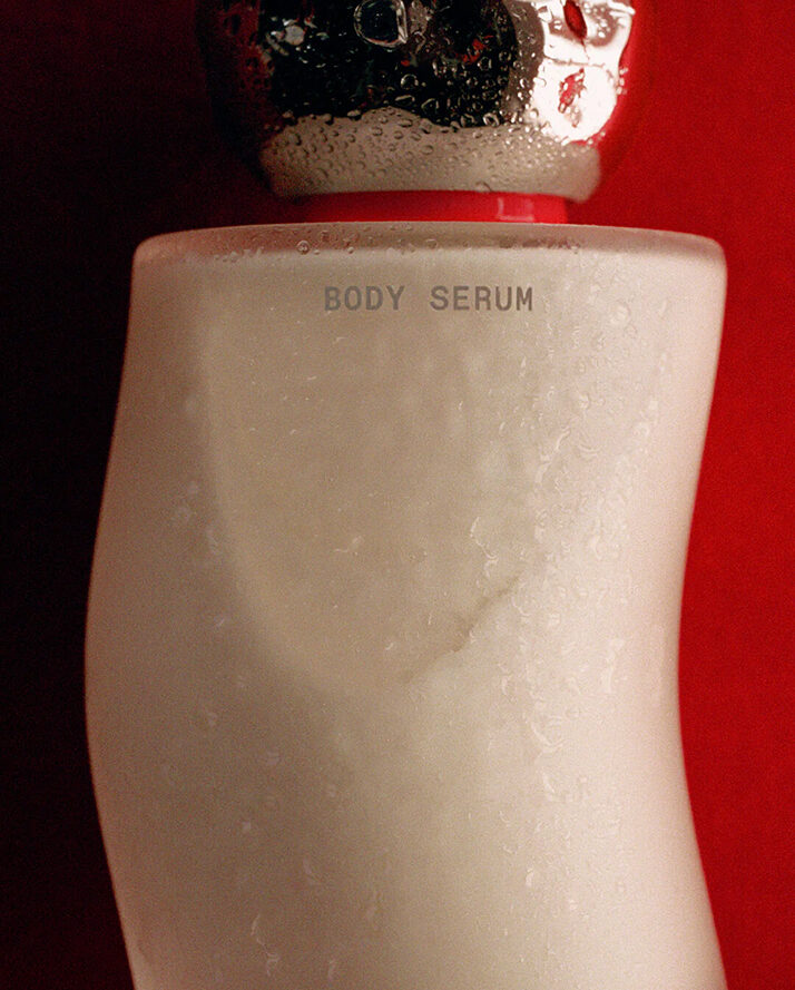
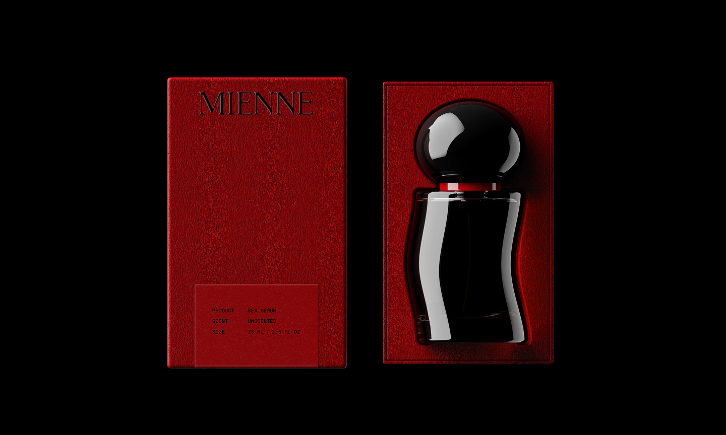
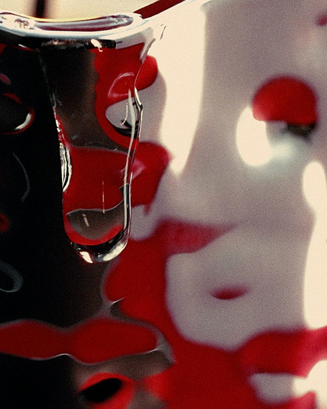
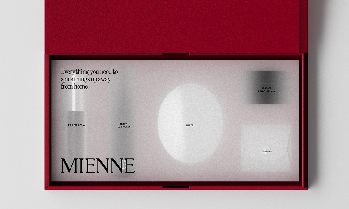
Primary packaging traces the curves and contours of the body, bulging against restraint and sitting tenderly in the hand. Materials evoke tension, from the frosted fog of a steamy car window to the smooth slick of something wet.
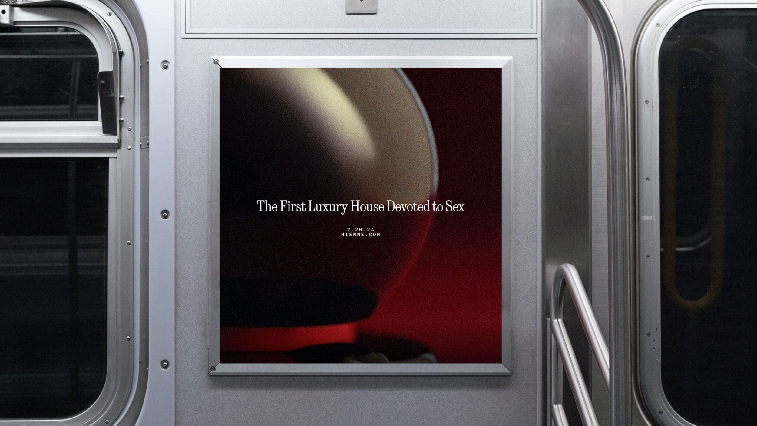
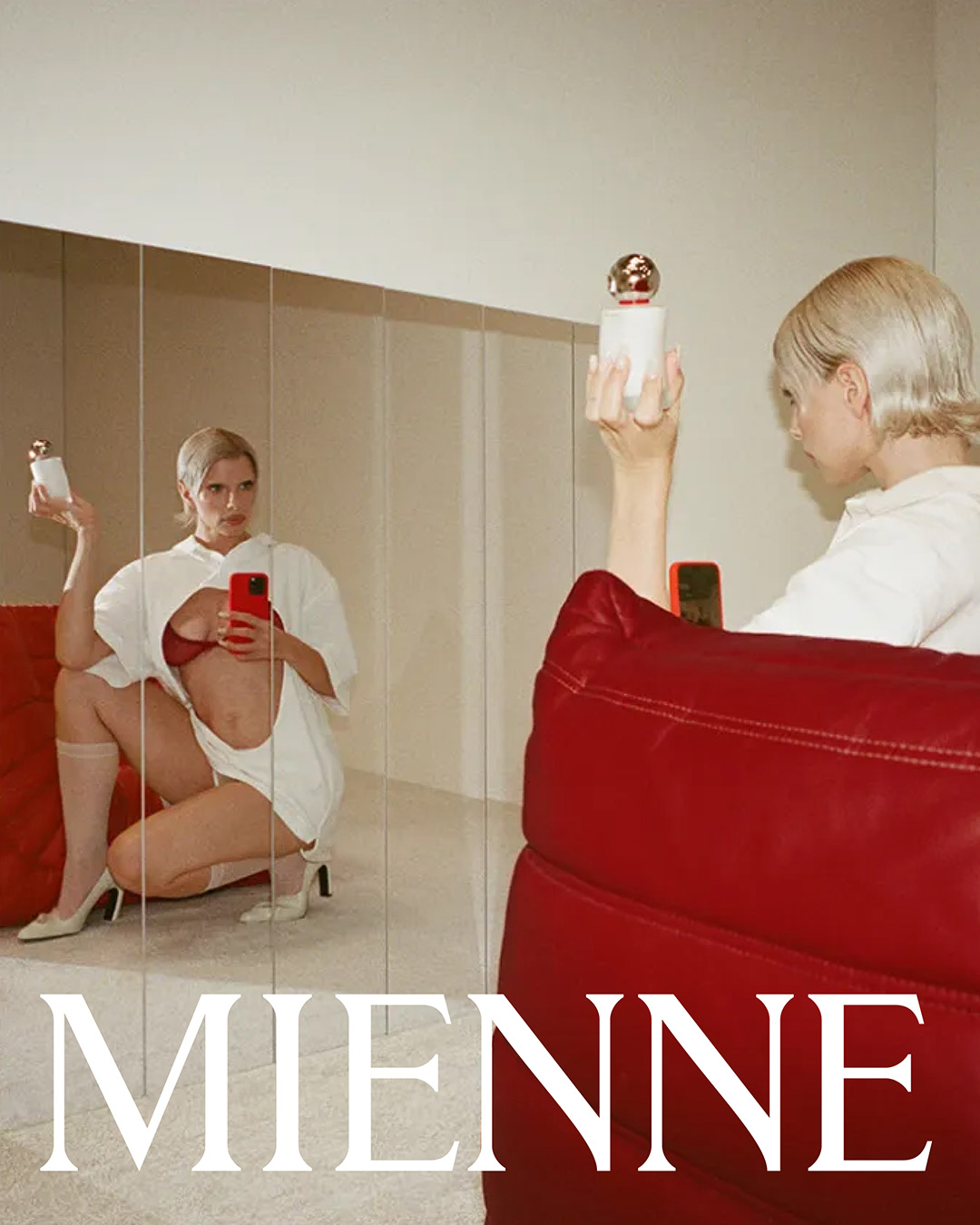
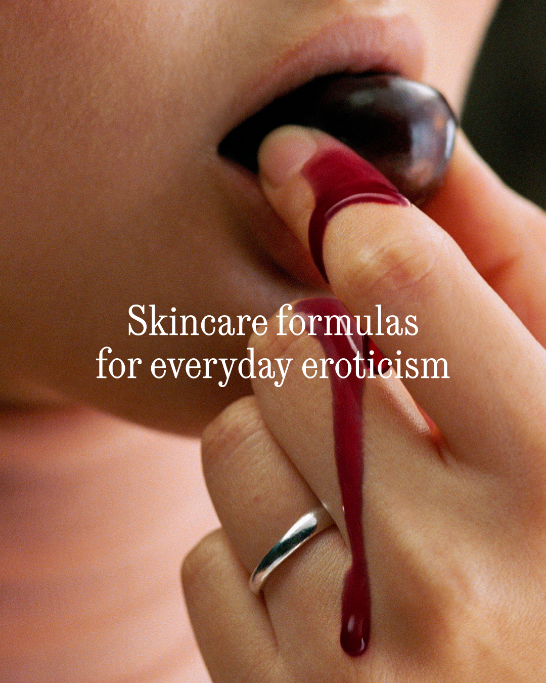
This sensibility extends into art direction, guiding a launch campaign developed by Chandelier Creative that explores a spectrum of eroticism, from covert to overt, through metaphors of touch, power, and pleasure found in everyday life.
Mienne reveals itself in the details—a subtle monogram, a flash of color, a rich texture—creating a system designed for small, unexpected moments of eroticism across every interaction.